10 Easy Product Page Design Strategies That Will Boost Your Conversions
What’s the most important page on your e-commerce website?
No, it’s not the home page, although the home page does play a key role in making a memorable first impression.
The most important page, in this case, is an underdog — your e-commerce product page(s).
It’s absolutely logical if you think about it. A great deal of your email, social media, and paid ad efforts have the purpose of sending traffic not to your home page but to specific product pages. That’s where the actual purchasing decisions take place.
However, only 2.5%-3% of e-commerce website visits result in successful conversions.
The culprit for such underwhelming conversion rates is usually poor design and optimization of product pages.
This post will discuss what makes the best product page design, delve into why each strategy works, and explain how to implement each strategy yourself.
So read on to learn great product page design tips that will take your business to the next level!
TABLE OF CONTENTS:
- 10 Easy Product Page Design Strategies That Will Boost Your Conversions
- 1) Keep the Primary CTA On-Screen
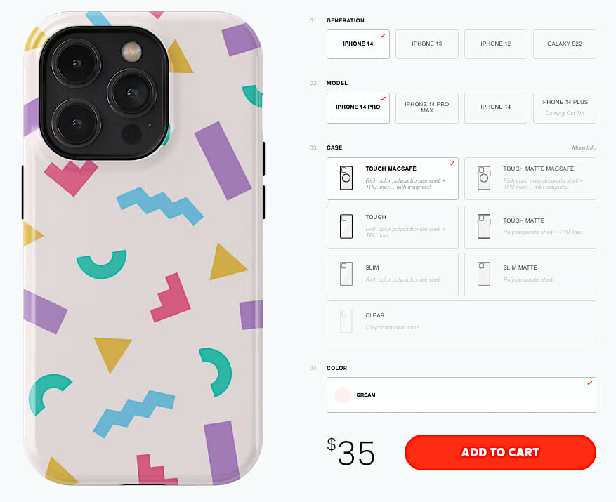
- 2) Make the Customization Process Easy and Intuitive
- 3) Optimize Product Copy
- 4) Diversify Your Product Gallery
- 5) Make Use of Price Anchoring
- 6) Use Visually Striking CTAs
- 7) Embrace Explainer Videos
- 8) Trigger FOMO and Urgency
- 9) Address Common Conversion Obstacles
- 10) Keep Mobile Shoppers in Mind
- Enhancing Product Reviews
- BONUS: Supplement User Reviews with UGC
- Final Thoughts on Product Page Design for the Win
10 Easy Product Page Design Strategies That Will Boost Your Conversions
1) Keep the Primary CTA On-Screen
A helpful rule of thumb is to make your call-to-action buttons highly visible.
The goal is to make the CTA stand out from other product page layout elements and direct your visitors’ attention toward it. Regardless of whether you believe that our attention span has shrunk by almost a quarter over the past two decades…
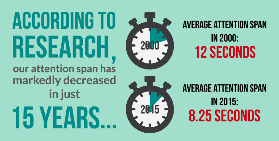
…the truth is that the amount of content we consume — U.S. adults spent an average of 13 hours 21 minutes per day with media in 2020 — contributes to our banner blindness, i.e. people’s tendency to ignore page elements that they perceive (correctly or incorrectly) to be ads.
53% of online shoppers expect e-commerce sites to load in 3 seconds or less.
This means that if you want to subtly remind your site visitors to make a purchase, keep the primary CTA on-screen at all times.
This sticky or floating CTA sticks to the top or bottom of your product page even when potential customers scroll so that it is right in front of their eyes. Including this tactic will improve your website UX, especially for mobile users.
So, one obvious benefit of the sticky CTA is that it’s less intrusive and annoying than a regular pop-up. On top of that, it ensures better site usability, as visitors don’t have to look for a “Buy Now” or “Add to Cart button on the page when they’re ready to purchase.
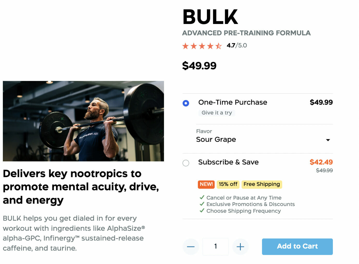
Transparent Labs leverages this clever strategy to optimize their product pages. Since there’s a lot of useful information below the fold, a sticky CTA button is always visible. Even when the shopper scrolls down the page to view product details, the conversion trigger doesn’t disappear.
Dive Deeper: How to Create Better-Converting In-Content Calls to Action (CTAs)
2) Make the Customization Process Easy and Intuitive
Brands that excel at personalization generate 40% more revenue than those that lag behind, and the same research study has shown that 71% of customers expect companies to provide personalized interactions:
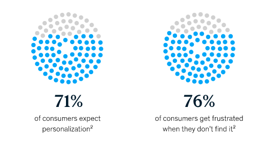
Based on these stats, it’s safe to conclude that delivering tailored experiences and catering to customers’ needs isn’t optional. Customization has become an indispensable element of every successful product page.
Even though customization is easy to achieve, you have to be careful not to overwhelm your potential customers. Choice paralysis is a real thing, and it happens when people are presented with too many options.
According to Hick’s Law:
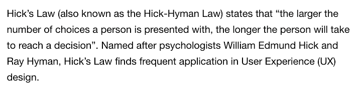 This delay can result in your potential customers giving up on purchasing from you and, in turn, hurting your sales.
How can you reduce this choice paralysis? Here are some tips:
- Limit the number of options on any given page or at least highlight a couple of the most distinct ones. You can always add the “More” button that will display other, less popular choices.
- Simplify the personalization process and make it easier for your prospects to customize the product they like.
- Offer default, predefined options based on the most popular choices and best-sellers. This will reduce decision-making fatigue in some customers.
It’s all about making the entire process as user-friendly as possible and helping your customers have their say in what the final product will look like.
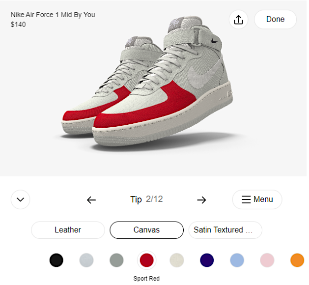
Nike does a great job of giving customers creative control over the sneaker model they want to purchase with their Nike By You offering. The brand’s product customization tool is intuitive and clearly lists all product elements that can be tweaked. Plus, customers can click on the sneaker section they would like to change and see the available colors or materials.
Dive Deeper: 3 Ways to Personalize the Customer Journey Experience
3) Optimize Product Copy
Write compelling product copy by clearly explaining your unique value proposition – why shoppers should choose your product over competitors. Ensure that your copy succinctly lists all features and benefits:
- Clearly articulate your product’s unique selling points.
- Highlight key features and benefits using straightforward bullet points.
- Anticipate common customer questions to reduce purchase hesitation.
- Detail warranty, free shipping, and easy returns policies to boost buyer confidence.
- Incorporate keywords naturally to improve searchability without sacrificing readability.
- Avoid industry jargon to keep the language accessible and engaging.
4) Diversify Your Product Gallery
One of the biggest barriers to a good online shopping experience is customers’ inability to touch, feel, try out, and experience products.
Professional product photography is paramount; not only should you include high‐resolution primary images, but you should also feature varied visuals such as lifestyle and instructional shots that illustrate product use. Such imagery can boost conversion and foster trust—just as major retailers like Amazon have demonstrated with their emphasis on high‐quality visuals.
While engaging all the senses is still a privilege of brick-and-mortar stores, you can use the next best thing — a diversified product gallery. Here’s how to create an optimal gallery (and be sure to use professional product photography).
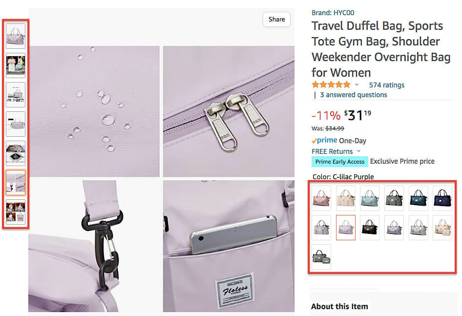
Provide as Many Different Product Images as Necessary
Showcase your product from different angles and close-ups to help your customers to envisage it:
Use high-quality images only, but make sure they’re optimized so that they don’t slow down your website. Grainy or pixelated images will only hinder your conversion rates since they don’t show your products properly, thus adding no value. Such a faux pas will both negatively affect customers’ perception of your products and damage your reputation.
Remember that visual appeal is a make-it-or-break-it factor when it comes to trust and credibility:
First impressions are 94% design related.
This means that your site visitors will be reluctant to give you their credit card number if your product pages come across as shady.
Offer a 360-Degree Product View
A 360-degree view functionality doubles as a substitute for visiting a physical store since it allows customers to move a product around and see it from different angles.
Additionally, by implementing this kind of UX design, you will be able to upload fewer images without sacrificing the user experience.
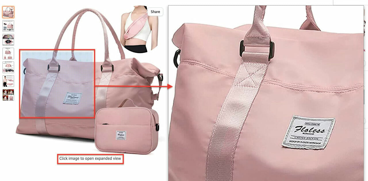
Enable a Zoom-In Functionality
When customers browse products in a physical store, they always want to look closely and inspect details. A zoom-in functionality mimics this and enables your site visitors to get a better visual understanding of a product and see its texture.
When they can explore the product in detail, potential customers feel more confident about making a purchase:
Show Your Products in Use
Contextualize every product by showing potential customers how others use it. This will give them a sense of what a product looks like in the real world and how it should be used.
In-context photos give customers a better idea of garment fit. For example, it’s more relatable and engaging to show a garment of clothing on a model than placing it on a flat surface.
It’s a good idea to include models of different sizes and ethnic backgrounds to connect emotionally with all segments of your target audience.
Leverage Video
88% of people say that watching a product video convinced them to make a purchase.
The ability of this format to condense a lot of product information in a short time frame is particularly powerful. We’ve already mentioned the short attention span problem, so instead of forcing your potential customers to read about product features and benefits, it’s much more effective to show all that in a short video.
Check out this short video on 5 Tips for Shooting Product Videos:

Show the Product Size in Real Life
Size does matter when you’re shopping online.
If you don’t want to mislead your potential customers, make sure they can visualize how big or small a particular product is. List all the dimensions of both the product and package and add a size chart for clothes and shoes.
If there’s even a slim (pun intended) chance that the size of a product can be deceptive, show its scale by placing it next to objects that can be used as points of reference.
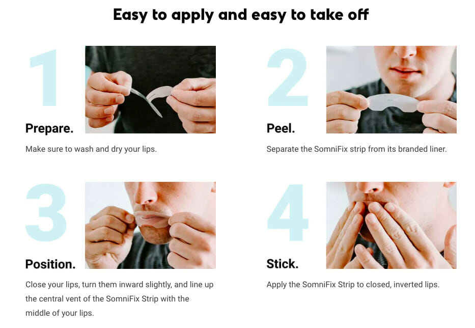
Somnifix is a great design example of product gallery diversification. The brand’s product page is packed with useful images, illustrations, and other visual elements that showcase how to apply their product, who can use it, and what its main benefits are.
5) Make Use of Price Anchoring
Marketing relies heavily on human psychology. Pricing is no different, and you can use several strategies to boost your conversion rates.
Customers have no idea how much a particular product should cost, so they form an opinion about whether a price is good based on several reference points. For example, they will check how much a similar product costs and use that number as a yardstick.
Also, if a product is in high demand, people will readily pay more. Hermès, for example, has been capitalizing on this for decades by creating artificial scarcity and an aura of exclusivity around their iconic Birkin Bag:

Hence, this evaluation mechanism indicates that your customers’ perceptions of the price are:
- Relative
- Susceptible to manipulation
Back in 2010, Steve Jobs gave one of his keynote presentations to unveil the company’s brand new product, the iPad. When discussing the price of this flashy gadget, Jobs addressed the speculation that its price tag would be just below $1,000, which is the industry code name for $999.
The audience learned more about the device’s benefits and, at that point, the price tag of $999 appeared on a big screen in the background — only to be crushed by a $499 price tag sixty seconds later:
Thus, when the price “dropped,” customers were under a powerful impression that they would save $500 and get an amazing product for just a fraction of its “actual” value.
This cognitive bias that Jobs masterfully played with is at the core of price anchoring. You can achieve the same effect by giving your customers the impression that a product’s actual price is much higher. The trick is in stating the initial price, crossing it out, and placing a new, lower price next to it. And voila! Your customers now think they are getting a great bargain.
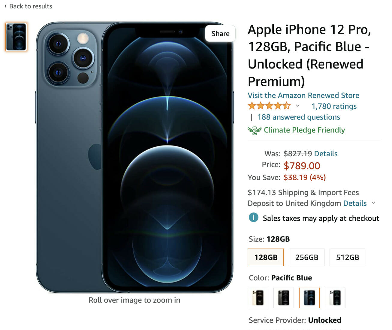
Amazon has developed an intricate pricing system in which anchoring is a frequent element. Their “Was” price refers to the median 90-day price that Amazon customers paid for the product in question. Besides the new, lower price, the e-commerce giant also highlights the amount and percentage that customers will save:
Dive Deeper: 10 Psychological Hacks to Improve Your Content Marketing
6) Use Visually Striking CTAs
In addition to compelling product descriptions, an effective call to action can do wonders for your conversion rate. That’s the reason why it has a second entry in this article.
Although crafting these couple of words placed on a button-shaped element might not seem like rocket science, the process actually requires a lot of research, data, and A/B testing (which is not just for landing pages and ads!). A recipe for an irresistible CTA is concocting the right combination of copy, size, color, and location.
Create Action-Oriented Copy
The point of a CTA is to tell your visitors what to do next and encourage them to take action.
So instead of saying “Buy,” your wording must be more compelling, specific and persuasive. Phrases such as “Find out more,” “Yes, I want a free trial,” “Get a discount,” or “Give me my exclusive deal” are more attention-grabbing and powerful.
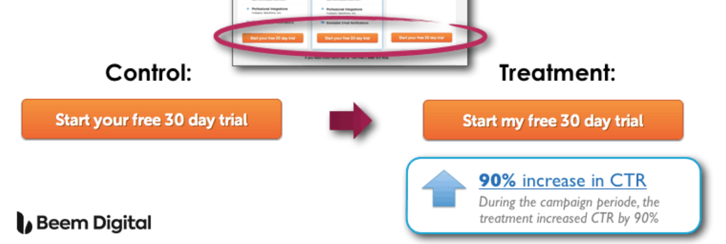
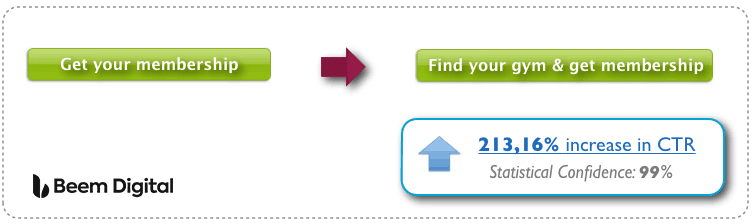
Here are two great examples of improved CTAs after A/B testing word choices:
- Change “Your” to “My” (make it personal to the reader). This test generated a 90% increase in CTRs in just 3 weeks:
- Add “Find your gym” (make it more helpful and value-laden for the reader). “Get membership” could relate to anything. This re-wording achieved a whopping 213.16% increase in CTRs:
Pick the Right Size
On the one hand, you want the copy in a CTA to be legible; on the other, you don’t want a gigantic button that will look cheap and off-putting.
The right balance is a button large enough to stand out but not to the extent of overwhelming other content on the page.
Cotton Bureau’s product pages feature conspicuous CTAs that are easy to read, and yet they don’t overshadow other elements of the page or come across as too salesy:
Use Contrasting Colors
Different studies attempted to pinpoint the most effective CTA color. But there is no one magical color; the only reason color matters is because it should make your CTA button pop against the background.
Using complementary colors (those on the opposite sides of the color wheel) will create the best contrast and increase the visibility of your call to action.
Another way to make your CTA noticeable and prominent is to leverage negative space.
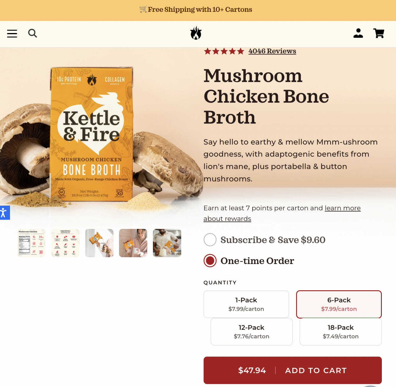
Kettle & Fire takes advantage of all these best practices: their CTA is bright red and highly visible against the white background. Another reason this example works is easy order customization and transparency. Customers can choose the number of packs they want to buy and see exactly how much they will be charged. There’s also an option to choose between a one-time order or a subscription.
Dive Deeper: How to Create CTAs that Actually Cause Action
7) Embrace Explainer Videos
In a report published by Social Media Week, respondents claim that they retain almost 95% of a message from watching a video. This is a significant statistic if your site is selling an unconventional product that requires a bit of “positioning” with the target audience.
Another telling statistic underlining the importance of video: 96% of people say they watched an explainer video to find out more about a product or service they’re interested in.
Explainer videos are especially useful for complex service products in the SaaS industry. If your product is unfamiliar to your typical buyer persona, invest in producing one or two videos for your product pages.
The reason that explainer videos are great for demonstrating how to use a product is because they work better for providing instructions. Instead of making your customers read a wall of text describing a particular product, offer them a short, engaging video that shows exactly how it works.
Plus, people are twice as likely to share videos with their network than any other format, which means that you can also expand your reach and generate more traffic.
Bay Alarm Medical leverages an explainer video to show how to install their medical alert system, so potential customers don’t have to look for written instructions:

Dive Deeper: How to Craft a High-Converting Explainer Video
8) Trigger FOMO and Urgency
Fear of missing out is a powerful conversion driver. When customers see that a product sells like hotcakes, they feel a strong urge to buy it.
In fact, 60% of millennials admit they make a reactive purchase usually within 24 hours after experiencing FOMO. This deeply rooted psychological phenomenon is triggered by a feeling of anxiety over the idea that you’re about to miss an amazing opportunity.
Scarcity and urgency are essential elements of FOMO. By letting your customers know that there are only a few items left in stock, you rush them into taking action before the product they have been eyeing runs out. Herd mentality is also closely related to FOMO. It’s a survival instinct that works on a subconscious level, pushing us to follow the crowd and do what others do.
Displaying stock levels is one of the most effective ways of taking advantage of FOMO.
Wherever possible, link your product page to your inventory database and inform users how many of the items have been sold or how many are left.
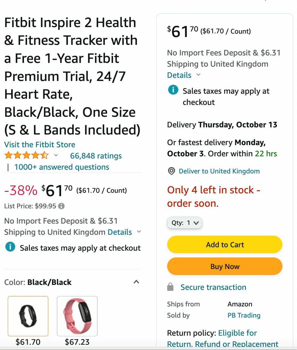
Fitbit instills a sense of urgency and scarcity in their customers by inviting them to order a fitness tracker soon since there are only “four left in stock.” Combined with a discounted price and more than 66,000 customer reviews, this tactic will very likely speed up customers’ decision-making process and boost conversions.
9) Address Common Conversion Obstacles
Although online shopping is a convenient way for customers to purchase a product from the comfort of their homes, there are some obstacles that can hinder conversions.
Let’s not forget that e-commerce stores are scattered across different countries or even continents, meaning that customers can’t visit or check them out. So it’s obvious that having some kind of trust signal will help dispel any suspicion about whether a particular store is legit and safe to purchase from.
The most common conversion obstacles are:
Transactional Security
Your customers are worried about how secure their credit card information will be on your website.
18% of people abandon shopping carts over these security concerns.
Apart from implementing a system that will keep your customers’ sensitive and credit card information safe, use trust badges to indicate that you exercise due diligence:

Safe checkout pages and accepted payment badges, together with third-party endorsements, will inspire trust in your customers and encourage them to follow through with their purchases.
Shipping Costs and Return Policies
Shipping costs and return policies can have a significant impact on your conversions. If your customers don’t see their total costs upfront, the odds are they will abandon the shopping cart without completing a purchase.
Similarly, given that they can’t try out the item they’re ordering, a generous return policy is something that can move them off the fence.
Availability of After-Sales Support
A conversion isn’t the end of the buyer’s journey. Once someone purchases from you, it’s crucial to deliver an exceptional customer experience and cater to their needs. If people aren’t sure what will happen if they need support post-purchase (particularly for higher-ticket items), they will be reluctant to do business with you.
So let them know exactly how they can reach out in case they encounter a problem or simply want to learn how to make the most of the product or service they purchased. An FAQ section is very helpful, but a direct number or email to contact the retailer is even better.
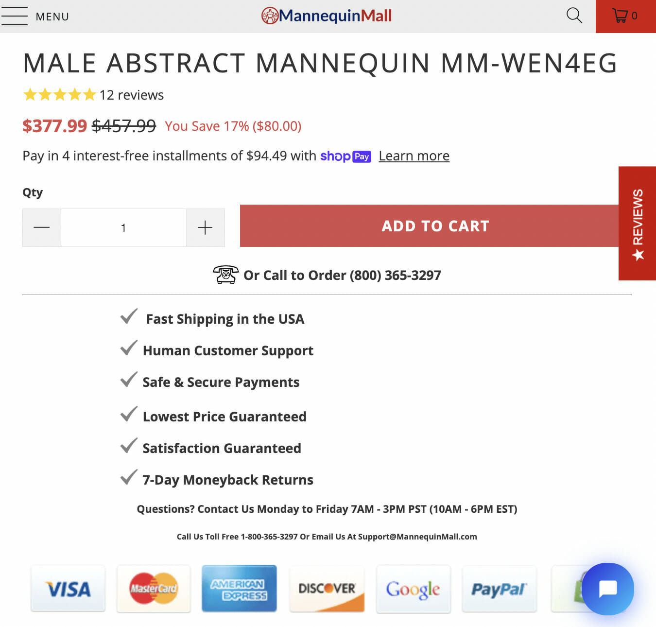
Mannequin Mall removes all conversion barriers by addressing all these concerns on their product page clearly. Their potential customers can get all the answers they need without having to search around the website, clicking back and forth in search of the elusive shipping policy, return policy or even contact page.
Dive Deeper: How Poor Website Security Negatively Impacts SEO Rankings
10) Keep Mobile Shoppers in Mind
Consider this:
- Mobile e-commerce spending is expected to reach $728.28 billion by 2025.
- For 59% of consumers, the ability to shop via mobile is an important factor they consider when deciding where to buy.
- 57% of internet users say they won’t recommend a brand with a poorly designed mobile site to their friends and family.
All these stats make a solid case for creating a mobile-friendly e-commerce store. That’s why you should always apply best practices when designing your product page’s mobile version.
Here are some tips for a mobile-friendly web page that won’t annoy your visitors:
- Keep the website design simple and allow for easy navigation
- Use large buttons to prevent the fat-finger error
- Avoid using pop-ups as they can be difficult to close on a mobile device
- Optimize images for mobile devices as that will increase loading speed
- Use the Accelerated Mobile Pages (AMP) framework to improve the server’s performance and boost the loading speed
- Turn off autocorrect on web forms to accelerate the filling process
- Use standard fonts that are easy to read
Many Mornings implemented a mobile-friendly web design on their product pages. Simplicity, easy navigation, large CTA buttons, and a clear process overview make it easy for customers to browse the product section, add a product to the shopping cart, and quickly access items they have already selected.
Enhancing Product Reviews
Customer reviews are a powerful trust signal that can drive conversions. Consider these tips to enhance product reviews on your page:
- Showcase verified customer reviews prominently to build social proof.
- Highlight key statistics such as “92% of consumers read reviews” and “84% trust online reviews as much as personal recommendations” to emphasize their importance.
- Incorporate user-generated content alongside reviews to add authenticity.
- Use clear calls to action, prompting satisfied customers to share their feedback.
BONUS: Supplement User Reviews with UGC
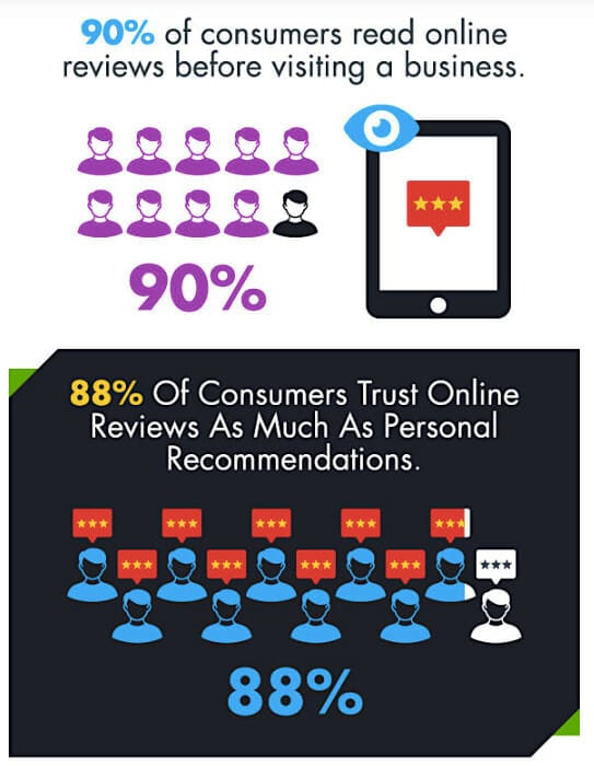
90% of customers read product reviews and testimonials while they’re researching a brand and 88% of them trust online reviews as much as product recommendations from friends:
To add another layer of credibility to your e-commerce store and product pages, encourage your happy customers to create user-generated content (UGC): “Just remember to be clear and concise with what you need. Often, people are more than happy to share content with brands in hopes of getting featured, but without specific guidelines, you’ll end up with a ton of unusable, low-quality content.”
By sharing images and videos of your products along with reviews, your existing customers will vouch for the legitimacy of your online store and the quality of your goods.
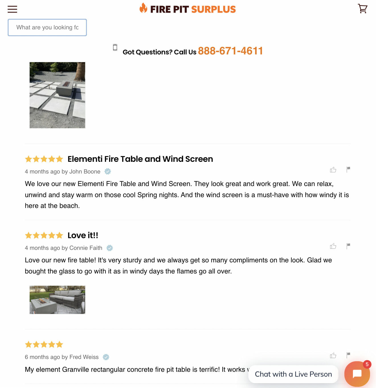
Fire Pit Surplus allows reviewers to upload photos of their products being used. This is incredibly effective social proof, thanks to its genuineness since it’s evident that it comes from real people.
Dive Deeper: 8 Ways to Encourage More User-Generated Content (UGC)
Final Thoughts on Product Page Design for the Win
Well-thought-out and optimized product pages result in significantly more conversions. When a customer gets to a product page, it usually means they’re purchase-ready, and it’s up to you to facilitate the checkout process and make it as smooth and distraction-free as possible.
These 10 strategies will point you in the right direction and walk you through the process of optimizing critical product page elements.
Hopefully you learned how to optimize your product pages for better conversions! But if you just want an expert CRO marketing agency to do it for you, click the orange button below 👇