Conversion rate optimization is often the best way to boost lead generation, because by making your conversion flow more efficient, you’ll increase your numbers and see a higher ROI on your existing investment.
To efficiently optimize, you’ll need to run A/B tests, and one of the best ways to run successful tests on your own website is by studying what works for other companies.
In this post, we’ve compiled 13 successful conversion rate optimization tests, their results, and ideas you can take away for your next experiment.
1) 37Signals
Many companies are slow and iterative when it comes to testing details of their landing pages.
37Signals (now Basecamp) took a different approach. Instead of testing bullet points or adding an image, they changed the entire design of their Highrise landing page.
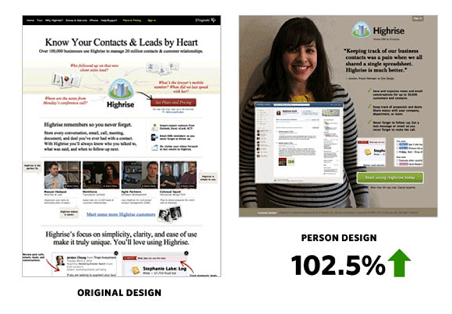
Their original design was a standard landing page with a clear headline and graphics that led into the body of the page. The new design shows a picture of a person, a quote as the headline, and a clear call to action without a lot of text surrounding it.
Their results were impressive. They managed to boost their conversions by 102.5% with the redesign, which is extremely significant for a site that has such high traffic numbers.
Learn More: 5 Important Landing Page Elements You Should Be A/B Testing
2) Sunshine.co.uk
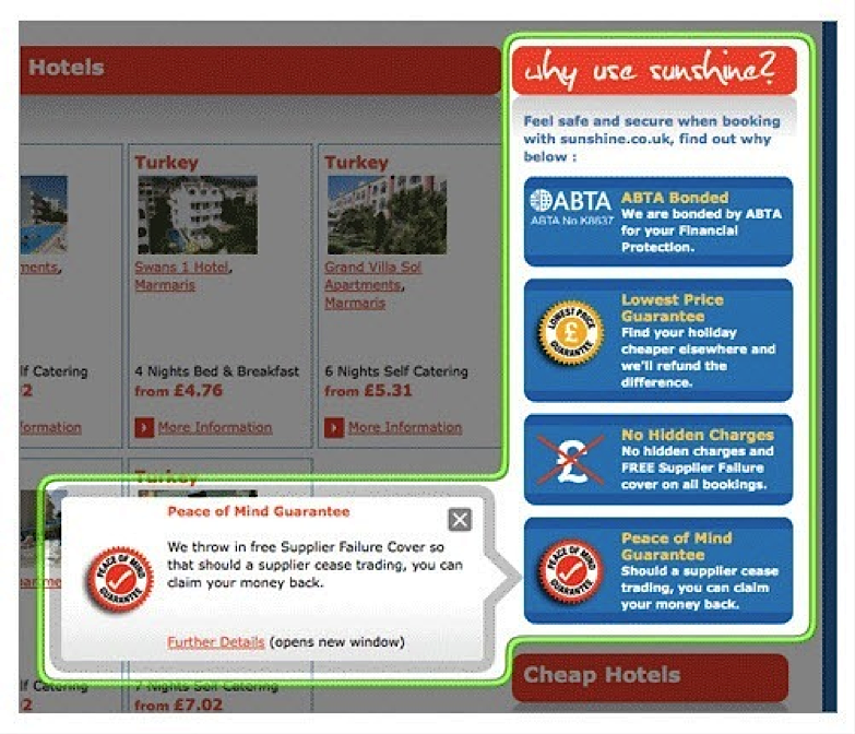
Sunshine.co.uk is holiday site that allows users to book flights and hotels at cheap prices. Through CRO, they were able to increase their revenue by £14 million (British pounds), which is around U.S. $17.5 million.
The first step to optimizing conversions on any website is collecting the right type of data. Sunshine.co.uk did user testing to see how they could improve their site’s UX and copy, which included collecting opinions from customers about their experience using the website.
Once the site was live, they did constant split testing to find ways to boost conversions. For example, they found that customers actually felt uncomfortable purchasing items for the low prices that were listed on the site.
To help alleviate these concerns, Sunshine.co.uk offered a “Peace of mind” guarantee so that customers could feel confident that they could get their money back if they didn’t get what they expected. This resulted in the impressive £14 million increase in revenue.
3) Walmart Canada
Walmart.ca boosted their conversions by 20% after implementing responsive web design.
As with most successful CRO experiments, Walmart started by investing a lot of time into research. Initially, they found that they were getting heavy traffic from mobile despite the fact that their site didn’t have a mobile “feel.” Their site also took a long time to load, which resulted in a high level of drop-off rates.
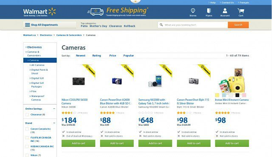
They tracked data on which browsers their users were using and their screen size. Walmart decided to use a scaling grid in their new design to ensure that it looked good on all platforms. Here’s what it looks like on desktop:
Here’s what it looks like on mobile:
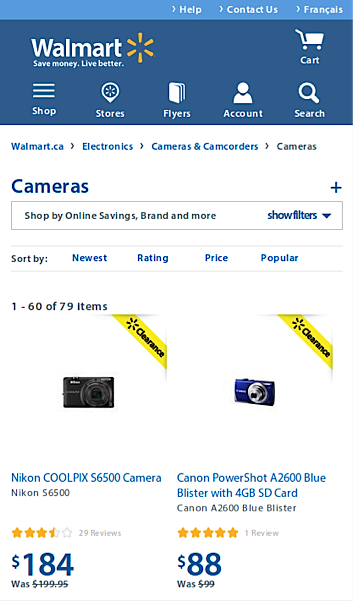
Walmart saw a conversion boost of 20% across all devices after the redesign, and mobile orders rose by 98%. For a site like Walmart that gets a huge amount of traffic, those are massive numbers.
4) CrazyEgg
CrazyEgg is a SaaS company that helps marketers analyze user behavior on their websites. Their software provides heatmaps that show where users are clicking on a web page so that businesses can improve the UX and boost their conversions.
CrazyEgg constantly runs CRO tests, but there was one that provided surprisingly good results — adding an explainer video to their home page.
Learn More: How to Craft a High Converting Explainer Video
Videos can help communicate your brand message and value proposition in an engaging, visual way that’s just not possible with text. This can especially help boost conversions if your product or service is very technical and/or hard to explain with written words. This was CrazyEgg’s main problem, so they decided to use an explainer video to communicate their product’s features.
Adding this simple video boosted their conversion rates by 64% and helped them get an additional $21,000 in monthly revenue.

5) TruckersReport
TruckersReport is a site that helps people complete their certification programs to become truck drivers. They’ve got a forum with both professional and aspiring truck drivers where they all share career advice.
TruckersReport also helps their community find job opportunities. Members fill out an online resume and receive offers from trucking companies.
However, they wanted to boost the number of people who opted in to receive job offer recommendations.

Based on their research and analytics, they came to the following conclusions:
- Around half of all website traffic came from mobile, but the website was not mobile friendly.
- The form headline was too generic. Nothing about “Get Trucking Job Offers Now” addresses pain points, fears, or hopes. According to surveys, truck drivers wanted higher pay, more benefits, and more work/life balance, but none of these factors were reflected in the form.
- There was no social proof on the landing page.
From this data, they created a new, responsive landing page for all devices:
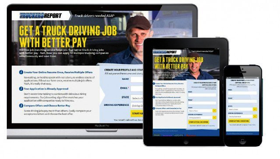
In addition, the headline was also revised to address the needs of truck drivers — landing a job with better pay — the photo was changed to look more relatable (i.e. a human face), and the CTA was changed to say “start getting job offers” rather than “send me job offers.”
The new landing page overall generated 21.7% more opt-ins than the original.
6) SmartWool
SmartWool is an e-commerce store that sells wool clothing such as socks, sweaters, and tights. Their target audience is adventurous people who want durable, warm clothing for running, hiking, cycling, etc.
SmartWool was a challenging CRO case because their website was already well designed — they already had a responsive website with many conversion-optimized design elements.
But to take their site to the next level, they had to come up with a design that was unique. So they varied the sizes of their images in the search grid and tested it against another page design that displayed product images in an easily-scannable row.
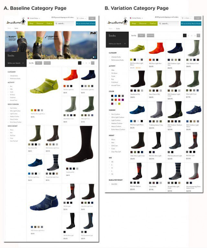
As it turned out, the more traditional page layout (image B above, which was their variation) had a higher conversion rate: it increased revenue by 17.1%.
One surprising insight from this test was that more clicks do not always equal more paying customers — although making certain product images bigger boosted the click-through rate, the standard grid still had a bigger impact on revenues.
7) ContentVerve
ContentVerve is a site that puts out content on topics like content marketing, copywriting and conversion optimization.
They ran a small test in which they moved their call to action from the top of the page to the bottom of the page (below the fold).

This test actually goes against conventional wisdom. Most marketers will tell you to keep your opt-in box above the fold to boost e-mail signups, and there’s data to prove that it works for many businesses.
However, it can also be beneficial to test putting your CTA in the “natural flow” of the landing page. For example, maybe it only makes sense to ask your visitors to sign up after you show them that your understand their problems or if your product is quite expensive.
In the case of ContentVerve, moving their CTA button to below the fold boosted their conversions by a massive 304%!
Learn More: How To Create CTAs that Actually Cause Action
8) Device Magic
Device Magic allows businesses to create data collection forms for phones and tablets.
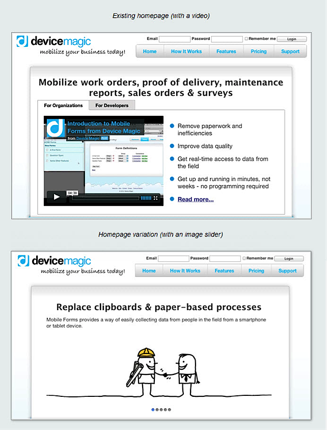
They wanted to boost conversions from their homepage, so they tested displaying an explainer video above the fold along with some key bullet points that summarized their features.
They also tested using a series of sliding images to convey their business’ message to see which would work better.
Explainer videos work well for many businesses. People like digesting information in the most efficient way possible, so a lot of brands see positive results by communicating their message via video rather than text. The data supports this too — 75% of business executives would rather watch videos to guide them through purchase decisions.
But that doesn’t mean it’ll work for you.
Surprisingly, Device Magic found that their series of sliding images boosted signups by 30% over the explainer video page — another testament to why you should be testing everything.
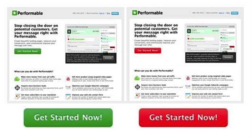
9) Performable
Performable is a marketing automation company that helps businesses analyze their marketing performance. They were acquired by HubSpot several years ago.
They changed their CTA button color from green to red, and this test shows that even changing something as small as a button color can make a significant impact on your conversion rates. CRO doesn’t necessarily have to be a complicated process. Altering small elements of your site like button colors, bullet points, etc. can be done without extensive research.
In this case, when Performable changed their CTA button color from green to red, their click-through rate shot up by 21%.
10) Electronic Arts (EA)
EA is a video game company that produces games like Sim City and FIFA sports.
When they released Sim City 5, it turned out that digital downloads made up over 50% of those sales in the first two weeks of launch. A big reason for this was a simple A/B test that EA did on their landing page in which they questioned even their most basic assumptions.
They wanted to know whether removing the “pre-order Sim City 5” banner image on their page would boost sales or not.
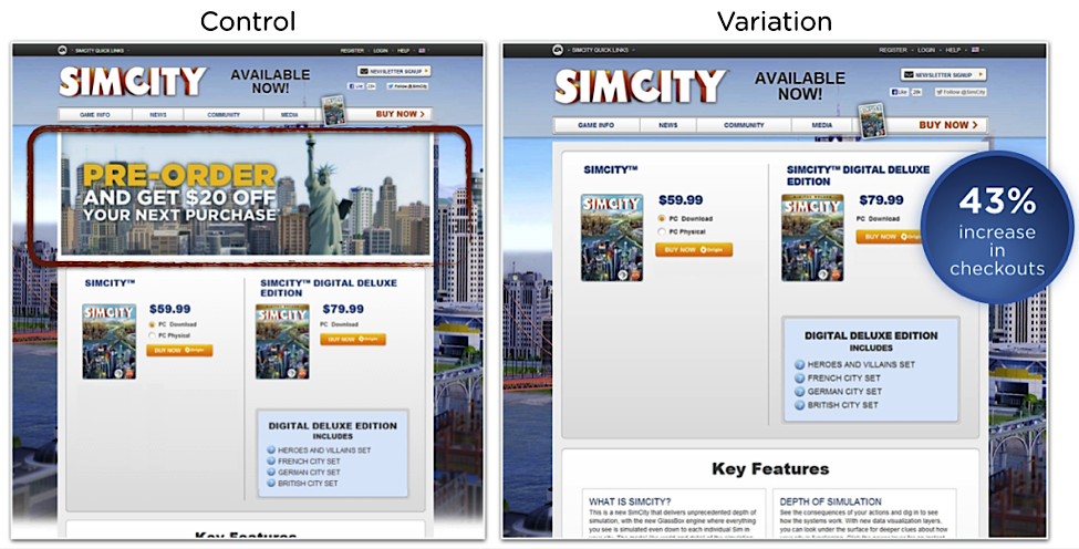
As it turned out, the “cleaner” version of the page without the banner image resulted in a 43% boost in orders.
This is another example of a basic assumption that most marketers wouldn’t even think to question, but testing a different approach led to hundreds of thousands of dollars in additional revenue for EA.
11) VeggieTales
VeggieTales is an animated cartoon series that many pre-school and primary school teachers share with their students.
This company wanted to boost revenue from their online store, so they ran a variety of site-wide e-commerce experiments.
For one experiment, they decided to remove the navigation bar to see how it would impact conversions. As it turned out, it helped them boost their revenue 14% per visitor.
The more options people have, the less likely they are to choose any of them. This also applies to conversion rate optimization and A/B testing — when you want your users to take a specific action, don’t give them a lot of other options.
12) Roller Skate Nation
Roller Skate Nation is an online store that sells roller skates and accessories.
One of the biggest problems with shopping for clothes, shoes and other apparel online is that there’s no way to try them on before you buy. Your only options are, in many cases, a generic size like “small,” “medium” or “large.” And even if the clothes or shoes have specific sizes, that’s still no guarantee that they will fit you well.
The inability to try on apparel is one of the biggest objections that people have to placing these orders online. And Roller Skate Nation realized this. The founder of Roller Skate Nation knew that giving sizing tips to people in person or on the phone worked well. For example, he suggests that you buy kids’ skates a size larger to accommodate for their constant growth spurts and make them last longer, and his sizing tip for this is: wear an extra pair of socks.
To tackle this problem on their website, they decided to add “sizing tips” to an FAQ section on their product pages.
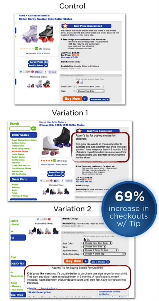
They found that checkouts increased by 69% after adding sizing tips to the product page.
The big takeaway here is to find ways to give your users enough information before they make a purchase decision, as well as use that information to help address their obstacles.
Related Content: How We Instantly Raised Average Order Value by 10%
13) Sony
Sony wanted to increase sales for their Vaio laptops.
They decided to test placing banner images on their website with a couple different major calls to action:
- offer an option for users to “create their own” Sony Vaio laptop
- double the SSD storage for free
The results of this test prove how you can get different results on different devices: Sony saw a 6% increase in click-through rates on their website, but a 20% increase in mobile click-through rates.

The big takeaway here is to make sure you tailor and monitor the results of your tests across devices, since what works well on mobile might not work the same on desktop, and vice versa.
Bonus! 4 Quick Conversion Rate Optimization Tips
1. Edit for Clarity
This is the most important point in this list.
Clear, coherent writing is a fundamental step for effective communication.
Thanks to user attention spans now resting at just over 8 seconds and the online habit of scanning content, getting your primary message across in as few words as possible is a necessity.
2. Run QA Tests
We operate in a world that has a love affair with the term A/B test.
It’s a term bandied around as if it were the sole method of increasing conversions. All you need is a control and a variable and you can see some decent increases, right? Wrong.
The majority of marketers out there understand the concept behind A/B testing, but few truly understand the best practices required for an effective A/B test.
3. Offer Guarantees to Remove Risk for the Customer
We’ve all found ourselves at an online checkout or subscription page and thought “Do I really want to do this? How can I be sure that I’m not subjecting myself to fraud or tons of spam e-mail?”
Trust is a major factor in increasing conversions. No one wants to feel as though they’re at risk should they click the purchase button.
4. Create Urgency
Buy now!
Sale ends tomorrow!
Only 3 left in stock!
I’ll concede the above claims often come across as overly aggressive and perhaps slightly dubious. But they really do work when it comes to increasing sales.
Conclusion
One of the most important things to keep in mind when running CRO tests is to question even your most basic assumptions because what works for one business (or many) may not work for you. For example, EA was able to boost conversions on Sim City sales by removing their banner image and ContentVerve boosted conversions by placing their CTA at the bottom of the page instead of above the fold.
Different tests work for different businesses, so you should test everything, including working with a content optimization agency.
What surprising tests have you run? Let us know in the comments!