How to Create CTAs that Actually Cause Action
You can write an eye-catching headline, compelling copy and include awesome graphics, but if you do not include the perfect call to action, your readers will remain just that: readers.
Calls to action are the final stage in your sales letter, ad, blog post or landing page. They capitalize on the attention you’ve hooked and the strong feelings of need you’ve built and then seamlessly lead readers to do what you’d like them to do. Without a powerful CTA, your marketing materials are nothing more than interesting reads rather than the action-causing, sales-driving materials you need them to be.
Consider these numbers:
- Emails that contain a powerful, single call to action get 371% more clicks than those without.
- For KISSmetrics, a CTA within a video gets 380% more clicks than their normal sidebar CTAs.
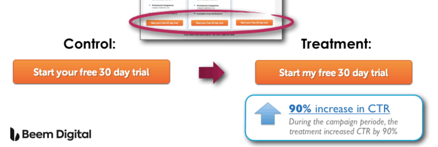
- ContentVerve saw a 90% increase in click-through rate by using first-person phrasing: “Start my free 30 day trial” vs. “Start your free 30 day trial.”
However, just slapping any old CTA at the end of your content isn’t going to work. Effective CTAs need to:
- Be compelling
- Have a clear benefit for the user
- Continue the conversion momentum
- Actually cause action – i.e. increase your conversion rate
Unfortunately, the majority of CTAs you see online are pretty weak. They display the default texts “Submit,” “Buy” or “Purchase,” none of which compel the user to actually take the action.
So let’s take a look at a few methods that you can employ to turn your call to action from a lackluster, run-of-the-mill instruction into a conversion machine!
TABLE OF CONTENTS:
A Good Customer Journey Leads to a Great Call to Action
Great copy illustrates how a product can solve the problem its target audience faces. As a whole, marketers have become pretty adept at solution-focused copy: they’ve developed headlines that communicate a product’s solution with laser focus and desire-building content that persuades with benefits and images.
But these individual elements don’t cause huge lifts in conversions. Your product doesn’t sell because it’s the cheapest or because the color is nice – it sells because it solves a problem, and asking yourself what your customers want will get you closer to answering this.
Research shows that 88% of consumers research before making a purchase either online or in-store. They jump from site to site to find the best deal possible. So a witty headline or a pretty call to action button is not what’s going to convince them that your product or service is the best solution in your industry.
Sales aren’t made on the effectiveness of one element. There needs to be a cohesive, complementary customer journey where every element in every stage builds upon the one preceding it.

Dive Deeper: 3 Ways to Personalize the Customer Journey Experience
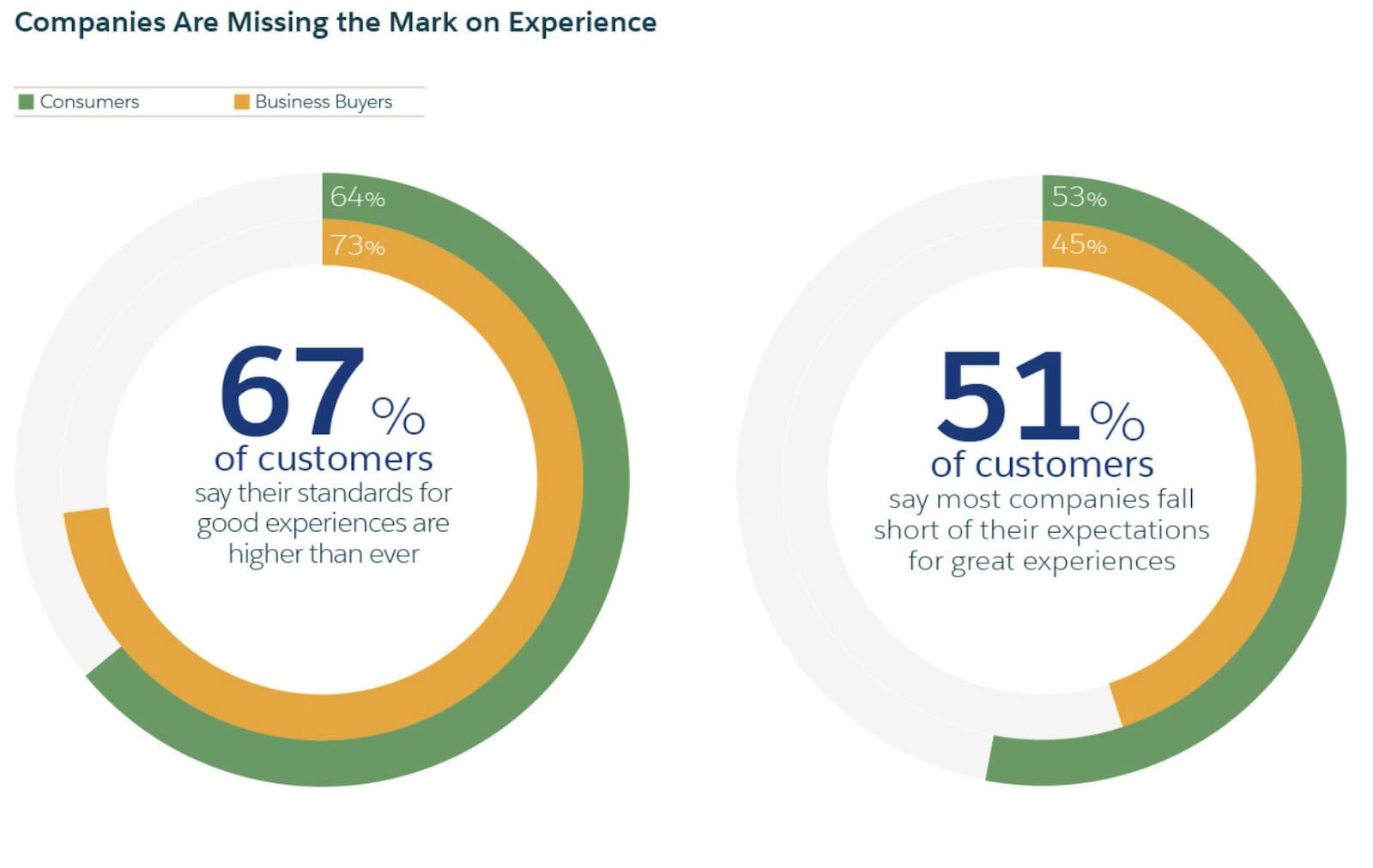
That cohesive customer journey is one of the most important aspects in marketing. It improves the customer’s experience of engaging with your brand, which is more important than you might think because:
- A moderate improvement in CX would impact the revenue of a typical $1 billion company an average of $775 million over three years
- 67% of consumers and 74% of business buyers say they’ll pay more for a great experience
- 51% of customers say that most companies fall short of their expectations for great shopping experiences:
A good experience is about helping the customer. It depends upon your ability to lead them from one step to the next without being overly pushy or, worse, too vague. Every stage needs to build on the last one to create a greater level of desire and need for your product.
Yet too many marketers fail when it comes to that final stage. They’ve created desire by focusing on the benefits with their headlines, lede and body copy only to then switch to a vague or blah CTA that shatters the benefit-focused approach they’ve taken.
No one wants to “Submit” their email address.
No one wants to “Buy” a product.
No one wants to “Order Now.”
These words are simply not compelling. They have negative connotations and, in the latter two cases, are related to a reduction of one’s bank account balance. Something we’d all rather avoid.
How Do You Ensure a Compelling CTA?
Continue to focus on the benefit! Use words that remind the customer that they’re getting something rather than telling them that it’s going to cost them.
Here are some great examples of improved CTAs after A/B testing word choices:
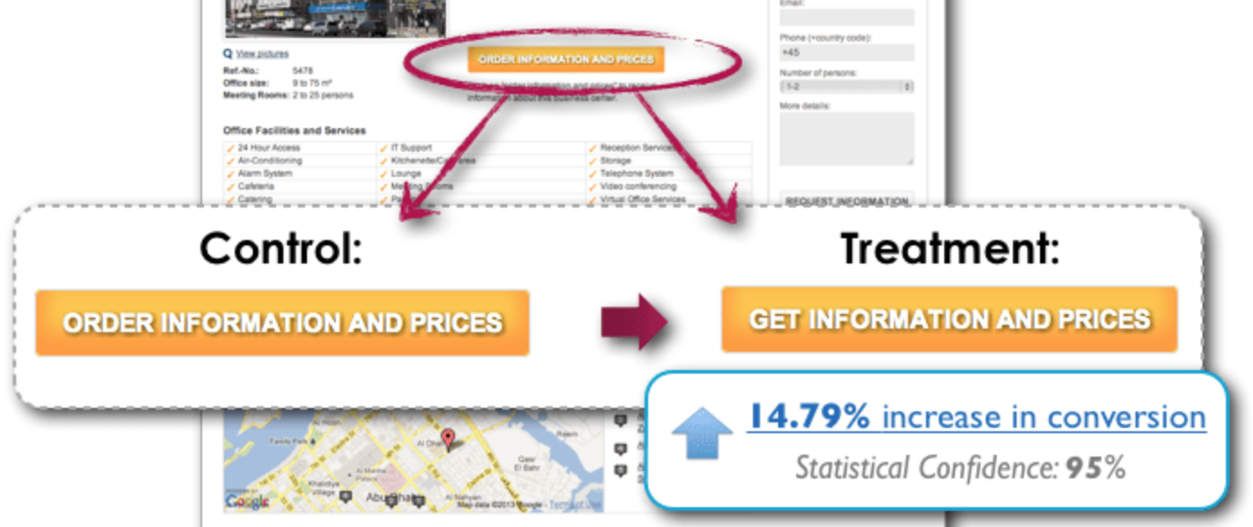
- Change “Order” to “Get” (make it more concrete for the reader). This test resulted in a 14.79% increase in conversion rates just by changing one word:
- Change “Your” to “My” (make it personal to the reader). This test generated a 90% increase in CTRs in just 3 weeks:
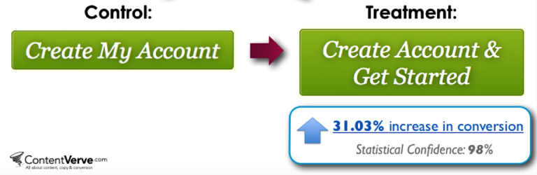
- Add “& Get Started” (make it urgent and immediate for the reader). This change generated a 31% increase in conversions:
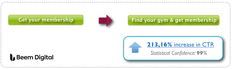
- Add “Find your gym” (make it more helpful and value-laden for the reader). “Get membership” could relate to anything. This re-wording achieved a whopping 213.16% increase in CTRs:
All four examples above expound upon the basic practice that a CTA should highlight the benefit.
Dive Deeper: How to Create Better-Converting In-Content Calls to Action (CTAs)
5 Tips for Creating CTAs that Actually Cause Action
Modern consumers are fickle. They’ll abandon carts or cancel payments on a whim if they have even the tiny measure of doubt. So you need to reinforce the benefits that they’ll be receiving at every stage. Don’t break the momentum you’ve built with a sudden mention in the call to action of what it’s going to cost them.
Here are five tips to help you create CTAs that compel the reader to take the action that you want them to.
1) A/B Test Your CTA Colors
One of the worst pieces of advice on CTAs is to turn all your buttons orange (or red or green). Just because it worked for another brand doesn’t mean that it will work for yours. If your company colors are orange and you add an orange CTA button to a page that is primarily orange, your button will get lost.
The success of Conversion Rate Optimization (and thus CTAs) relies on the elaboration of a basic three-step plan:
- Research and analyze your audience.
- Find the colors, designs, language, etc. that resonate with them.
- Amend your site to incorporate these elements and create a better customer journey.
You can’t just copy someone else’s methodology and expect the same results. You need to find what works best for your audience. Back in 2009, there was a lot of talk about the big orange button and how it was “the future of marketing.”
People went crazy over it and copied the button only to find that it didn’t bring the results they wanted. Why? Because they ignored the basic three steps in which you must focus on your own audience.
Since then there have been plenty of other studies on CTAs — studies that show orange isn’t always the best choice. (How’s that for irony?) Check out this test from Matthew Woodward, who ran different color combinations to see which would generate the highest CTR:
Matthew ran a number of different banner color tests and found that the top performer was the red banner (and orange came in second to last!). You could argue that red is a more prominent color and so will grab more attention, but that’s not always the case.
In this test from Monetate, the blue button actually outperformed not only the orange one (seen below), but also the red one, providing a 9% increase in conversions:
![]()
I could pull out many more statistics and studies all day long, but it’d be a huge waste of both our times because the truth is that there is no one perfect color for your CTAs.
The secret to effective CTAs is not orange vs. green – it's having the button stand out from the rest of the page. Share on XBut don’t take my word for it. Visit the website of any successful business and look at their CTAs. Are they all orange or are they in fact optimized to stand out from the background?
Take a look at the following examples.
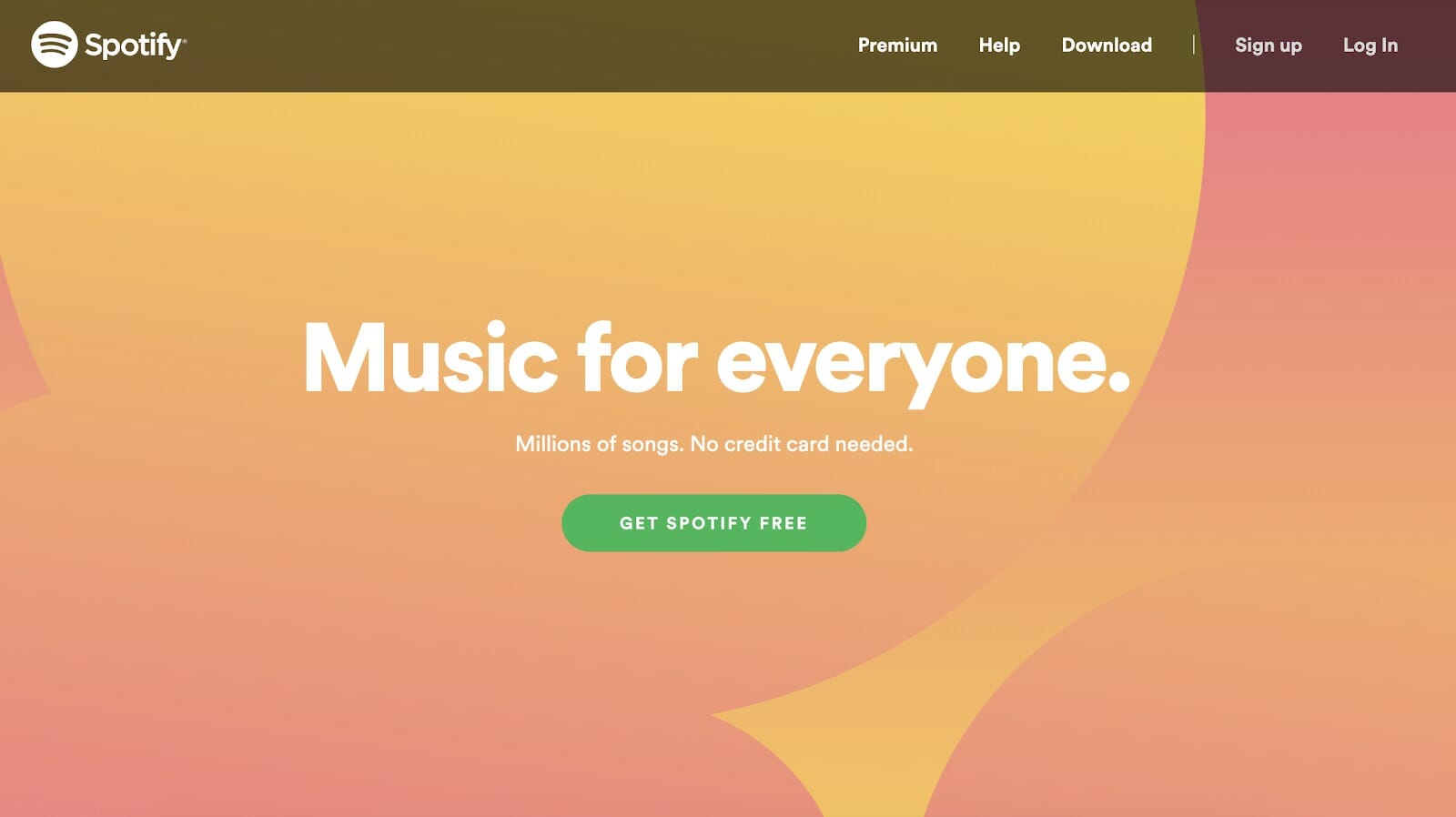
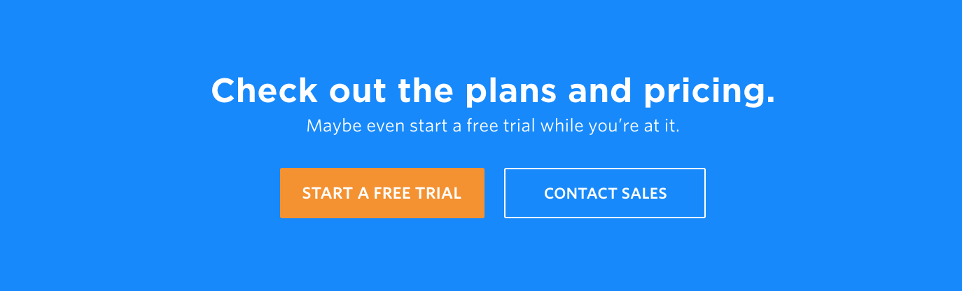
Here’s a powerful CTA from Spotify. Is the button orange? No. Do you know where to click? Absolutely!
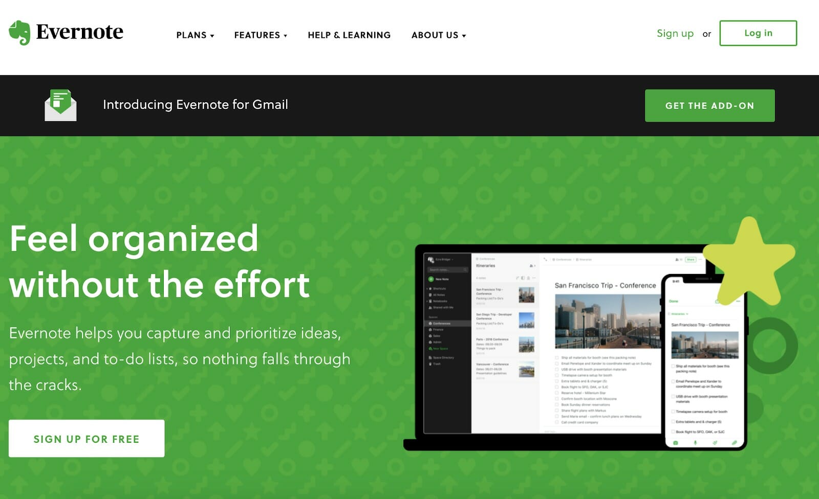
Here’s an example from Evernote. Once again, the CTA is not orange, and yet your eye is drawn to it.
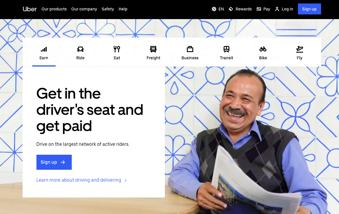
And the CTA button (also not orange! 🙂 ) on Uber’s homepage clearly stands out against the rest of the text and images:
Let me say it again: What actually matters is making sure that your CTA stands out from the rest of the color scheme on the page.
Monetate wrote the following regarding a test they ran of a blue versus an orange CTA button:
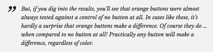
There is no gold standard for the color choice of your CTA button (not even gold!). You simply need to test different variations to discern what stands out, draws attention and resonates best with your audience.
Dive Deeper: 5 Important Landing Page Elements You Should Be A/B Testing
2) Position Your CTA Sensibly
While we’re on the subject of dispelling bullshit advice, let’s address the fold.
I don’t buy the advice that putting your CTA above the fold is always best. Sometimes it is, sometimes it isn’t. The question is figuring out when it’s a good idea and when it’s not.
Personally, I like to use what I call the “logical point of decision” approach.
Before you slap your CTA above the fold, ask yourself if your prospects would be ready to purchase from you at that particular point in their customer journey. Have they had enough time to analyze and understand the benefits of your solution so that paying for it seems like a wise investment? If not, then it’s too soon for the placement of your CTA.
Generally speaking, this rule follows the principle that the more complex your offer, the lower down on the page (or later in the customer journey) your CTA should appear:
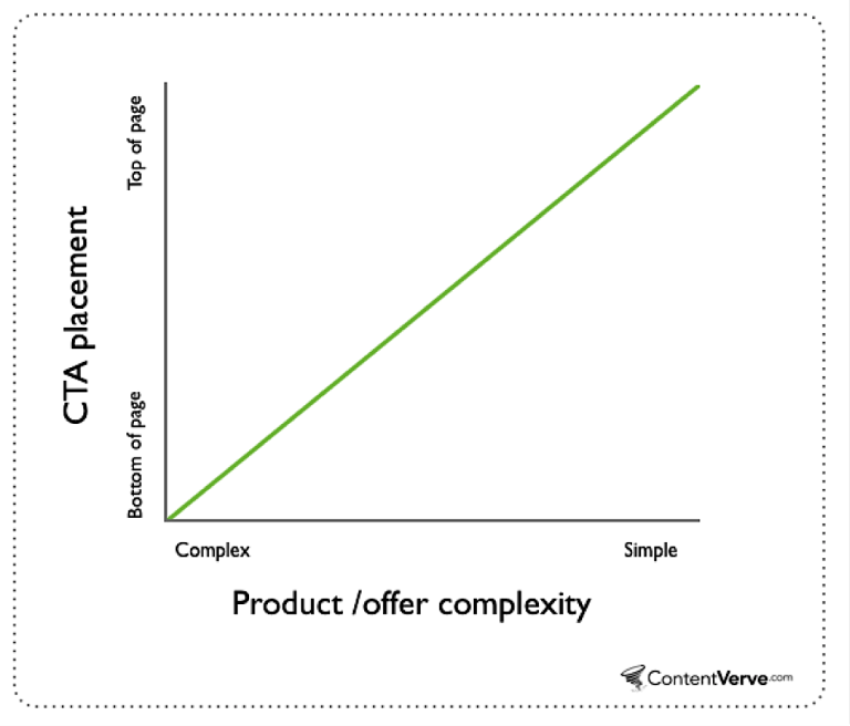
This rule also works with the cost of the product. The more expensive it is, the lower down on the page your CTA needs to be. Why? Because convincing someone to spend thousands of dollars will take more convincing than asking them for 10 bucks.
Let’s put it in real-life terms. Imagine that you’re shopping at the mall. The first store you enter sells apples — a simple product, the benefits of which are easily explained. As soon as you walk through the door, a sales assistant says, “Hey, you wanna buy some apples? They’re good for you, taste delicious, and are only $4 a bag.”
What are the chances of your buying a bag of apples? Pretty high, right? If you’re in the market for apples then that’s all the convincing you need.
The next shop sells TVs. Again, upon entering, a sales assistant approaches you and says, “Looking for a TV? That one’s good. It’s 3D, HD, comes with a free Blu Ray player, and is only $4,000.”
Would you buy it right then? Probably not. Why? Because you haven’t received enough information about it for you to spend $4,000 without some serious consideration.
If you were interested in buying a new TV, you’d probably spend at least a few hours researching the best options, reading reviews, talking to sales assistants, and ensuring that the set you were planning to buy had everything you needed in a television.
Asking potential customers to purchase an expensive product upon immediate entrance in a store isn’t going to convince them. It comes across as pushy, eliminates trust, and will put people off buying from you.
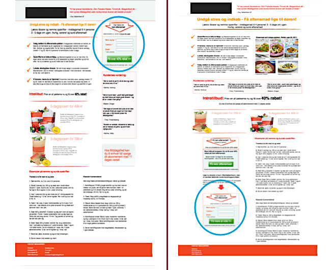
Michael Lykke Aagaard of ContentVerve used this approach with one of their tests and, after moving the CTA lower down on the page to a more logical position, saw a 304% increase in conversions:
Websites that are not very complex to understand can have a clear CTA above the fold for a free trial or even to purchase the product. For example, check out Hootsuite’s home page:
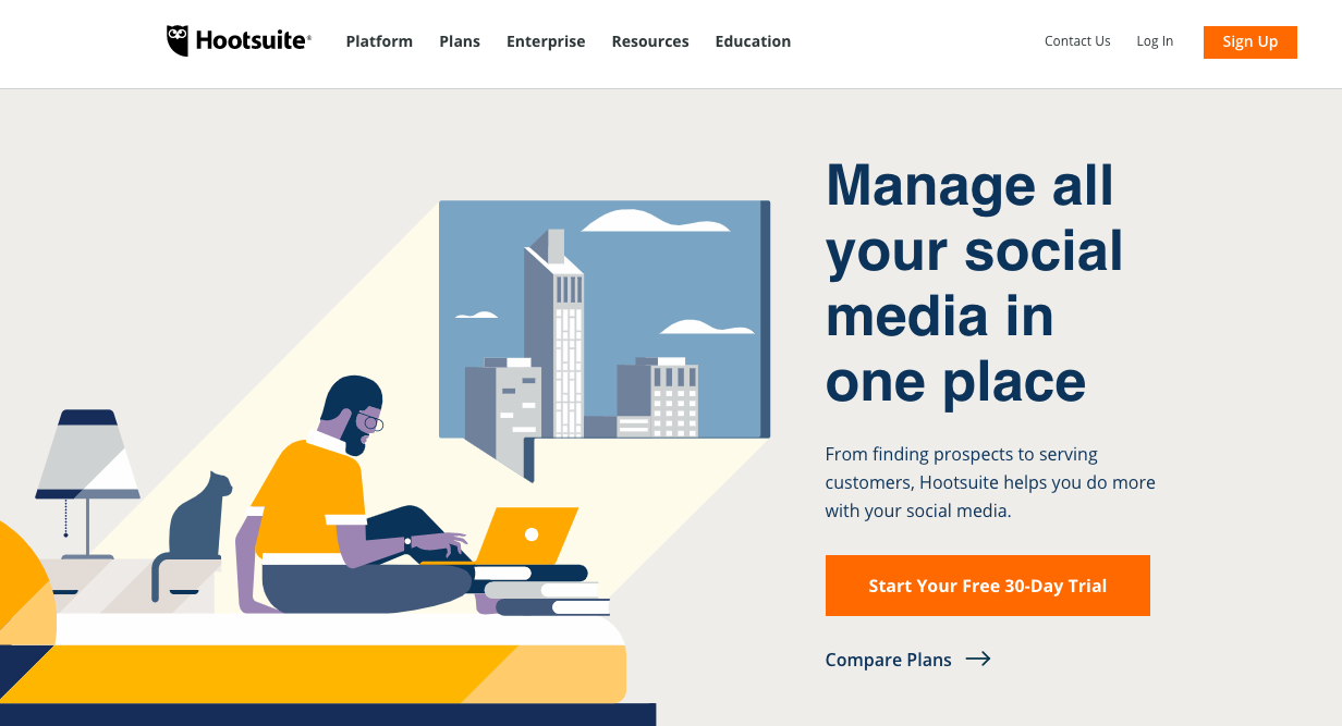
Their product helps marketers manage multiple social media campaigns across platforms, and because most people who land on this page are there for a specific reason, it makes sense to have a CTA above the fold offering a free trial. The visitor can jump right in and start using the software.
But on the other hand, Unbounce needs to give more information to its users before they’re ready to take any action. These are the two CTAs they have on their home page:
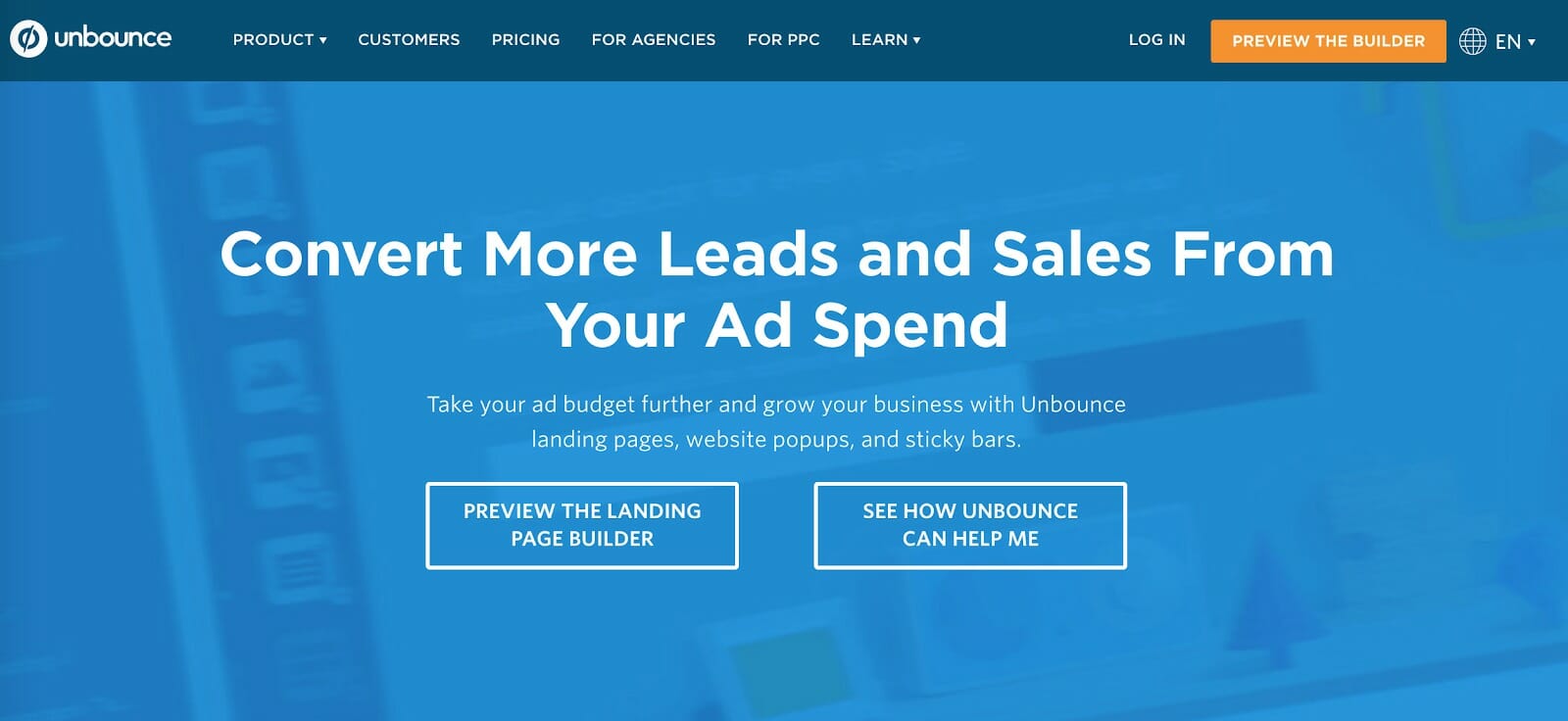
They include two CTAs, both offering more information before visitors commit to anything. “See How Unbounce Can Help Me” will show them how the product addresses their pain points and “Preview the Landing Page Builder” lets them actually try out the product. Offering two options appeals to visitors at different stages of the customer journey.
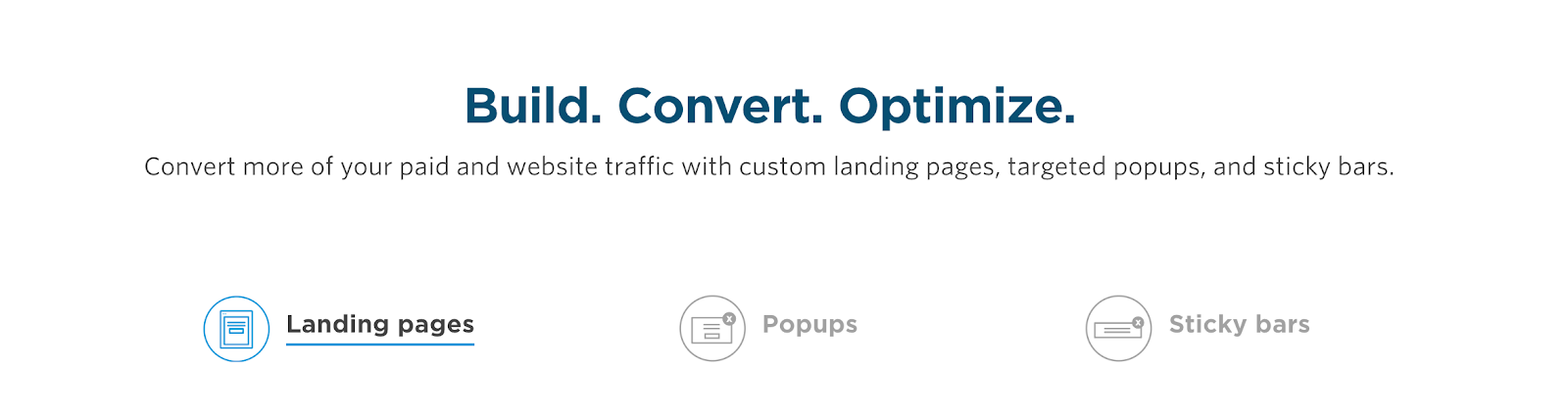
Unbounce has a variety of features built into the platform. So before they can ask people to part with their money, they have to let potential users learn more through a product-focused page:
After people have learned what they need to, Unbounce can ask them to sign up for a free trial with a CTA at the bottom of the product page:
Notice that the “Start a Free Trial” button is made more prominent with contrasting colors.
If you have a complex product that requires a bit of explanation or “teaching” before people are ready to sign up, you could actually reduce your conversions by presenting a CTA too early.
When positioning your CTA button, examine the complexity of your product and the price of it. Put your CTA at a place where both desire and the logical decision to pay are greatest.
Dive Deeper: Making Data-Driven Decisions for Better Website UX
3) FOMO – Use Urgency and Scarcity
Nothing supercharges your conversion efforts like adding a little urgency. When CROs speak about urgency, they often refer to the inclusion of countdown timers or limited stock displays. The thought that we might miss out on a deal or a product might run out – aka FOMO (Fear Of Missing Out) – is often enough to coax us into immediate action.
You can create urgency in your CTAs with the addition of a few simple words. Instead of using statements of benefit such as “Get your free e-book,” experiment by adding certain urgent elements like:
- Get your free e-book right now!
- Get 50% off today only!
- Only 3 left in stock!
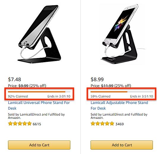
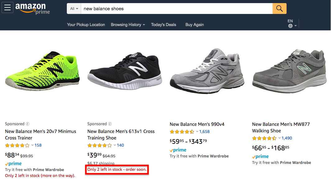
Amazon, as always, does this very well:
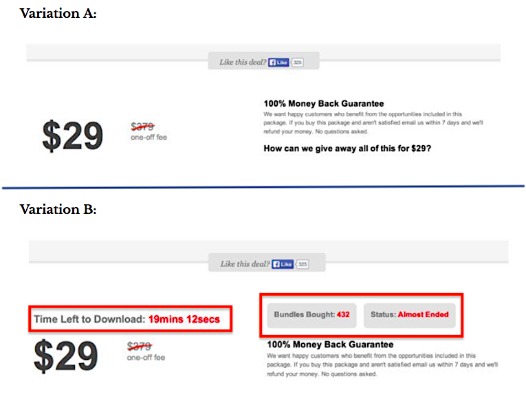
Urgency is always a winner in CRO. Marcus Taylor, writing for ConversionXL, A/B tested urgency in his CTA, which resulted in a 3x conversion rate (from 3.5% to 10%):
One thing to watch out for when adding urgency to your CTAs is: don’t do it too often. Part of the reason urgency works so well is that it makes the action that the user is about to take feel more important than all the other potential actions they could take.
So if you add too much urgency to your page, or try to persuade customers with urgency too frequently, then it could lose its effect in the long run. That’s why it’s best to save this tactic for your most profitable CTAs.
Words of urgency are simple to implement and provide an easy win for you. That extra word or two may not seem like a big deal, but sometimes the best solutions are the simplest ones.
Dive Deeper: How to Use Scarcity on Your Landing Page to Skyrocket Conversions
4) Remember – One Page, One CTA
The golden rule of landing pages that should never be broken is: One page, one purpose.
If you want people to sign up for a newsletter, that’s the only CTA that the page should have. If you want them to purchase a product, that’s the only CTA that should be on that product page.
Never complicate matters or confuse your users with multiple CTAs. When faced with too many options, people will get overwhelmed and avoid making any choice.
Take this example from the early days of Firefox:
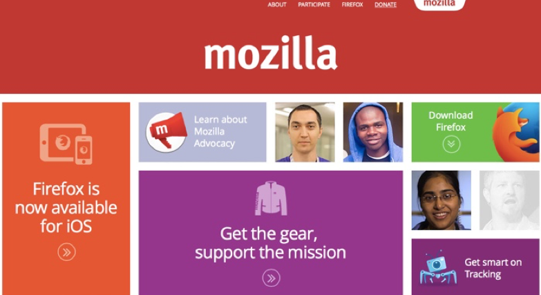
Users are coming to find a web browser download, but where’s the CTA?
It’s up in the top right corner, the text is smaller than the other links, and there’s no clear button at all. This page is cluttered and confusing. It gives visitors no clear idea of where they should click.
Take a look at Firefox’s CTA today:
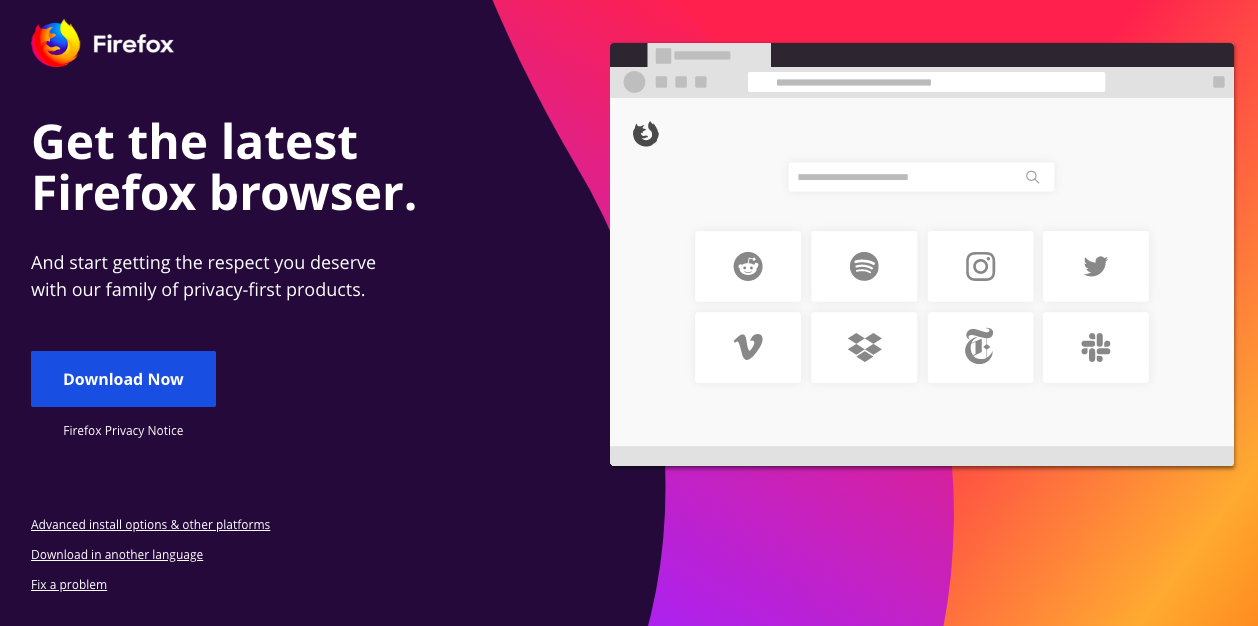
What a difference! The button is clear, stands out with a contrasting color, there is only one option (“Download Now’) and the page is uncluttered and well designed.
Oli Gardner calls this “the attention ratio” and says that you need to aim for a
ratio of 1:1. That ratio signifies the number of actions a user can take and the number of conversion goals. Oli actually managed to secure a 31% increase in e-book downloads after changing his landing page from a ratio of 10:1 to 1:1.
Remember that the key difference is in the ratio, not the number of CTAs. You can, in fact, use multiple CTAs on your page as long as they all have the same conversion goal.
Long landing pages are the perfect example of how to effectively utilize multiple CTAs. A long landing page will have numerous points of logical decision where a user is ready to make a purchase. Those already aware of the product will need little convincing, while unfamiliar prospects will need to read the whole thing.
A smart marketer will place numerous CTAs throughout the page at the various points where different customers are most likely to purchase.
Take Basecamp’s landing page, for example:
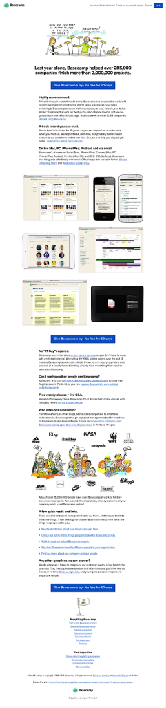
There’s a lot of copy there but they’ve made good use of several CTAs at points where people will be ready to click.
Dive Deeper: 7 Mistakes in UI and UX That Are Costing You Engagement
5) Make Your CTAs Responsive for Mobile
With 51% of the time spent online now being through mobile, you must make sure that your CTAs are responsive to different screen sizes and devices.
The last thing you want to do is spend all that time testing and optimizing your CTA to find that over half of your visitors aren’t able to view it correctly.
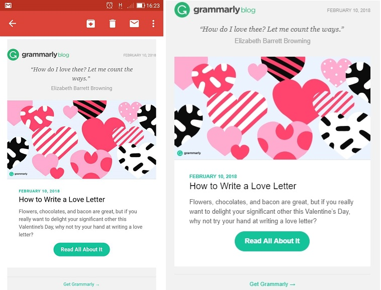
This pre-Valentine’s email from Grammarly is a responsive design, so it displays well on both mobile and desktop:
Landing page builders often have built-in features to ensure that your pages are responsive, but if yours doesn’t, there is a free tool that can help.
Make sure to test your CTAs on every device, browser and operating system so you find any discrepancies and sort them out.
Closing Thoughts
CTAs may be small, but they’re incredibly mighty. You simply can’t overlook their importance and must give them just as much time and attention as any other page element.
Keep these rules in mind to make sure that your CTAs are as effective as they can be:
- Use value-focused words
- Test different color combinations (try to find contrasting yet complementary colors)
- Place your CTA at the logical decision-making point on the page
- Use urgency in your CTA copy for more immediate action
- Keep a 1:1 ratio between actions and conversion goals
- Make sure your CTAs are responsive
As with any other CRO advice you read, never take this article at face value. Remember to always look at the underlying assumption and methodology. If someone says orange converts best, don’t change everything to orange; rather, run your own color tests and see if this is true for your site.
If you’re not a CRO-savvy marketer or you just don’t have the time, Single Grain can help you! We’ve helped businesses of all sizes improve their marketing ROI, ultimately increasing revenue – check out some of our case studies here.
Click below for your FREE consultation to see how we can help you with your conversion rate optimization. (Have some non-CRO questions? That’s cool, too! Let’s chat.)