Getting visitors to convert and generating more business opportunities is the ultimate business goal. Whether you are working on designing a dynamic website or creating a mobile app, getting users to convert by clicking on that call to action button is the reason behind your software product’s existence. It’s easier said than done, though.
For optimizing your software for bringing in conversions, understanding the psychology behind what makes users tick is critical. Knowing the basics of psychology and the application of these principles in designing the product is the key to designing a dynamic website or app that converts.
Designing for conversions not only enhances the user experience of customers when they land on your website or use your mobile app, but it also boosts customer satisfaction, brings in more leads into your sales pipeline, generates more sales and results in higher profitability of your business venture.
What Exactly Do We Mean by Conversions?
Any action taken by the visitor on your website or app that fulfills your business goals is quantifiable as a conversion. The needs of every business are unique and the definition of conversion varies depending on your unique requirements and business model. If you have an e-commerce website or app, conversions are a no-brainer. Every time customers make a purchase, they convert and you generate and increase sales. But for other business models, conversions aren’t so straightforward.
If your software product is a SaaS website, getting leads and form submissions qualifies as a conversion. For other business models, getting user information, a sign up for a trial or demo and even newsletter subscriptions are a form of conversion. Any tangible action on your website or app that gives you an insight into the success of your offering and has an element of measurability counts as a conversion.
Dive Deeper:
- 15 Fast and Easy Ways to Improve Your Site’s Conversion Rate
- 7 Hacks to Boost Your Conversion Rate
- 7 Marketing Strategies that Work to Increase Conversions
How Do You Design for Conversions?
The key to successful conversions isn’t tricking the visitors into clicking where you want them to. Obsessing over a design that focuses on users completing the action that you want to be done rarely works. The design philosophy needs to follow a strategic roadmap and work its way backward to focus on the customer’s needs instead of just the business goals.
The majority of the decision-making process takes place on a subconscious level. Focusing on providing the customer with value and keeping in mind the psychology principles that affect human behavior and decision making while designing your website or app is the secret to achieving conversions.
Here is a list of 10 psychology-backed principles that have the potential to bring your customers one step closer to converting.
Dive Deeper: 7 Mistakes in UI and UX That Are Costing You Engagement
1) Ensure Fast Loading Time of the Application
A good first impression doesn’t solely depend on how attractive the design is. The actual process of visitors forming an impression of how your application looks and functions starts subconsciously before the application even loads. Now that page speed is one of Google’s ranking factors (called the “Speed Update”), the time required for a website or app to fully load has an even bigger impact on conversions for your business.
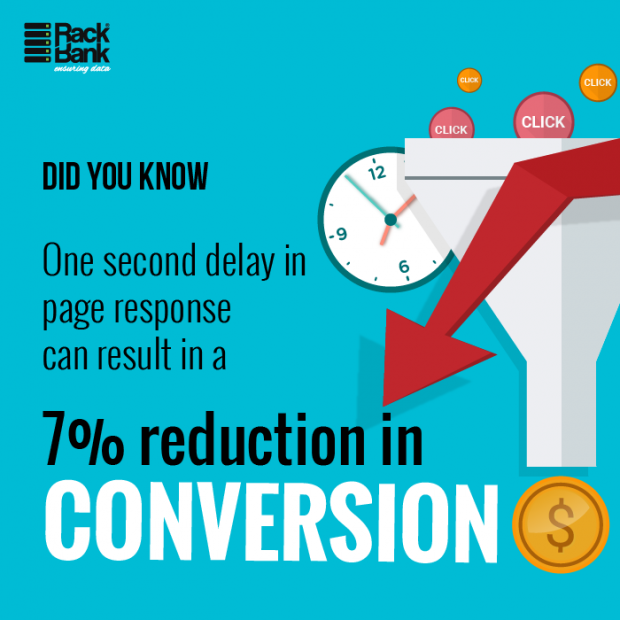
Users tend to get distracted if the loading time is too high, which negatively impacts the conversion rate. Consider these stats:
- 53% of visitors will abandon your website if it takes more than 3 seconds to load
- 77% of websites take more than 10 seconds to load on mobile
- 47% of visitors expect a web page to load in 2 seconds or less
- A 1-second delay in page response can result in a 7% reduction in conversions:
The design of the application should ensure that the loading time remains as fast as possible. The size of images and other elements used should be optimal – less than 500 KB is recommended for best results – to ensure faster loading time.
If you’re using WordPress, there are several plugins that compress images to optimize the file size, like:
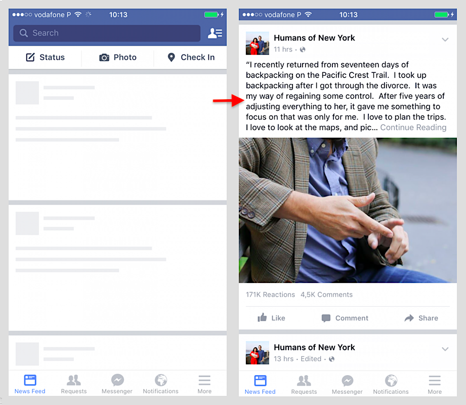
Placeholders and loading indicators can be incorporated within the design to make users feel that the time spent waiting is not as long. The best example of this strategy is the Facebook website and app which makes use of a temporary layout that keeps users engaged while the actual content loads. This results in an illusion that the loading time is shorter than it actually is:
Related Content: 9 Best Web Hosting Providers
2) Start with a Stellar Value Proposition
The real reason users end up on your website or download and open your app is because they are looking for a potential solution to their problems. If you build an app that addresses their problem and offers a specific solution for it, the chances that they will bounce are very low.
A value proposition is “a promise of value to be delivered, communicated and acknowledged. It is also a belief from the customer about how value will be delivered, experienced and acquired.”
The value proposition needs to be incorporated into the design in such a manner that it clearly addresses the target user’s problem and communicates how you can help resolve that. In the case of a website, the value proposition should be included as an above-the-fold design element to ensure that it catches the visitor’s attention immediately without their having to search across the website for it.
In the case of a mobile app, the needs of the users should be addressed upfront. The communication of what your application does to solve their problem and how to go about implementing the solution must be highlighted in the UX design.
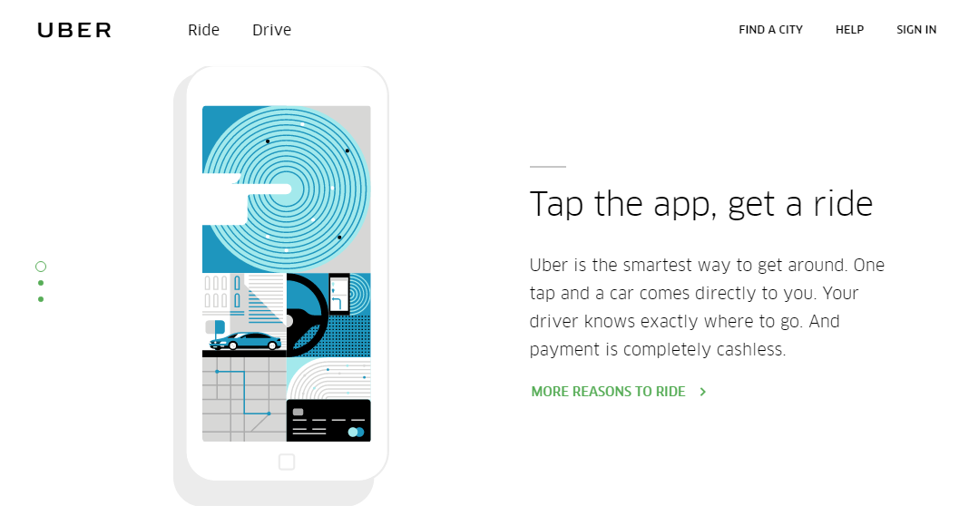
Uber’s value proposition does a fantastic job of addressing the hows, whats and whys of the user’s problem:
You cannot expect users to click on your call to action button without providing them with enough value to justify their actions. The CTA must always follow the value proposition, not precede it. Remember, you aren’t selling your product, you are selling the solution to the user’s problems.
Dive Deeper: How To Create CTAs that Actually Cause Action
3) Use Design Cues to Direct the Site Visitor’s Attention
The visitors that land up on your website or download your app need to have visual cues to help them navigate through the different segments and sections, so designers and marketers must ensure that they use the design elements and content to help users make sense of your application.
This is where Gestalt psychology gets incorporated within design. Gestalt is derived from a German word and translates to a unified whole, or “the whole is greater than the sum of the parts”. In design, it means that the impact that the individual design elements have is less than the impact of the whole designed when viewed all together. The context in which the elements are placed matters a lot in design.
The 6 Gestalt principles are:
- Similarity
- Continuation
- Closure
- Proximity
- Figure/Ground
- Symmetry and order
Making use of these design psychology principles, the visitors’ attention can be directed where you want it to be. The law of similarity states that humans have a tendency to group similar-looking things together and any variance in similarity causes the item to stand out from the rest (Von Restorff effect). Using this principle, the critical areas that require a site visitor’s attention can be made to stand out.
A very simple design example would be:
 The middle shape stands out because it breaks the pattern of similarity. This differentiation can be done by using contrasting colors, different font types and sizes or simply bolding or italicizing the content you want to focus attention on. The critical elements such as the headline, value proposition and call-to-action button can be highlighted so that the visitor’s attention is directed there.
4) Bank on Past User Experience
Every user has certain predefined expectations with regards to a website or application design based on their previous experience. Too many deviations from their expectations act as a subconscious turn off. The human brain is lazy and prefers to perform actions that require little or no thought, so staying close to user expectations when designing the interface gives you a psychological advantage.
Past user experience has an effect on subconscious decision-making by means of visceral reactions. Banking on the user experience helps make a stellar first impression and generates feelings of trust in your application. It also makes navigating easier for users and has an overall positive impact on user conversions.
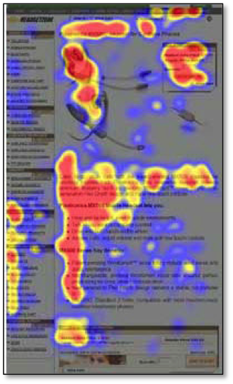
How can you incorporate past experiences into your current design? Eye-tracking studies show that users follow F or Z patterns to scan the screen. As a result, all the important information should be placed within these zones. This not only helps direct the focus, but it banks on past user experience because visitors are used to this familiar placement.
This heatmap shows the F-shaped eye-tracking patterns on a webpage of an e-commerce website:
Dive Deeper:
- How to Create Intent-Based Content to Improve Conversions
- How to Increase Your Conversions with Online Customer Engagement
- Top 10 User & Customer Feedback Tools to Improve Conversion
5) Reduce the Clutter
The human brain has a tendency to steer clear of complexity. Having a cluttered design increases the cognitive load on the brain which leads to a feeling of being overwhelmed. Too much sensory overload due to the incorporation of too many design elements compels the users to abandon the application, thus adversely affecting the conversion rate.
This is the Law of Prägnanz, which states:
“People will perceive and interpret ambiguous or complex images as the simplest form possible, because it is the interpretation that requires the least cognitive effort of us.”
You want to make the user experience as effortless as possible, and minimalistic design is the way to reduce visual clutter. Incorporate plenty of white space in the design because that gives people the space to rest their eyes. The goal should be to say more with fewer words, so only the content that truly adds value should be added to the design.
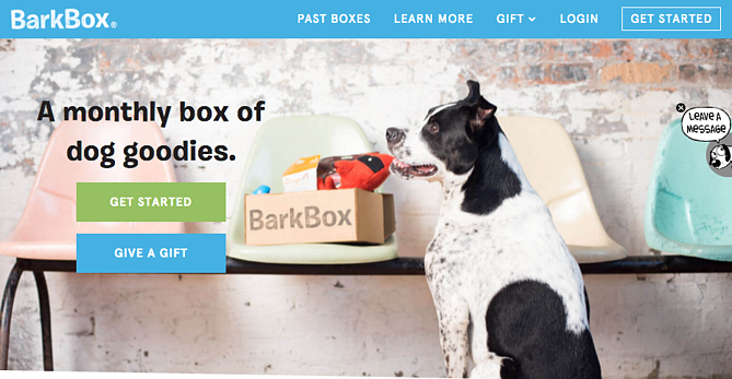
The website of BarkBox is a great example of clutter-free UX design. The banner image features a dog whose gaze is directed at the headline. This resonates with the brand appeal, unconsciously engages human emotion and simultaneously directs the visitor’s attention to the headline and subsequently the CTAs:
Visual clarity promotes better decision making and makes for more appealing designs. It also has a positive impact on conversions.
6) Steer Clear of Jargon
Business owners, designers and marketers often forget that their target customers don’t have the level of technical prowess that they do and end up incorporating technical terminology within the application, which acts as a huge turn off for users.
Put yourself in your website visitors’ shoes and write compelling copy with the least amount of technical jargon. Avoid words that hinder comprehension, and if you must use certain phrases, be sure to clearly define it or link to a source that goes into more detail (like we did above with the Law of Prägnanz).
The content on your app should ideally be less than half of the conventional form of writing. If long-form content is absolutely necessary, break it up into smaller, more easily comprehensible chunks so that the consumption of the content does not cause distress to the readers.
Dive Deeper: Making Data-Driven Decisions for Better Website UX
7) Establish Trust
Privacy and security of personal information is one of the biggest threats to conversion. If the design of your website or mobile application looks dubious, visitors tend to shy away from clicking on the CTA which, of course, leads to loss of potential conversions.
Make it a point to reassure users that their data is in safe hands before you ask them to input any sensitive personal information. Add trust badges, which are small icons that verify that your website is secure. According to Bluehost, “as many as 61 percent of participants said they had decided not to purchase a product because it was missing a trust seal.”

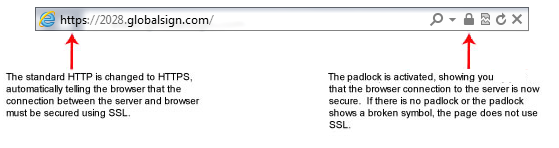
Another standard way to establish trust is by installing an SSL Certificate on your site, which will change the application protocol to HTTPs (instead of HTTP – the ‘s’ stands for ‘secure’) and show a green lock in the URL bar:
Or you can add the closed lock symbol near the submit button in the form fields to further send out psychological reassurance and have a positive impact on conversions. Including a link to the privacy policy and terms of use along with the lead capture forms also goes a long way to establish trust.
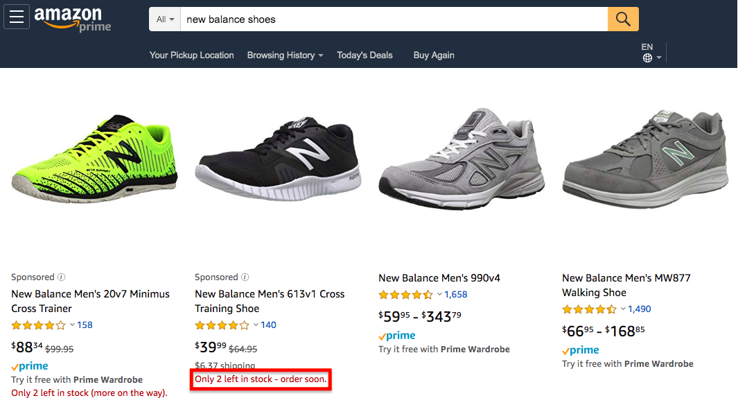
8) FOMO – Evoke a Feeling of Scarcity
The best trigger that causes people who use your application to click on the CTA button is FOMO – Fear Of Missing Out – which promotes a feeling of urgency and scarcity. If your business deals with sales, just a small indicator of the number of units left in stock can compel your visitors to convert. It not only acts as social proof that other people are converting, but it also generates instant action. Amazon, of course, does this very well:
In case of a non-tangible product offering, your trigger may be based on a promotional event that has only a few seats remaining or an offer that you might be giving out for a limited period of time. No matter what you are offering your customers, it is vital to stay authentic and not fall into the gimmick of false scarcity induction.
In this day and age, people are smart enough to distinguish genuine offerings from shady ones. A promotional time-bound strategy to drive conversions only works if it is actually being offered for a limited period of time. If the scarcity persists throughout the year, site visitors are going to see through the façade and it will negatively impact your conversions instead of boosting them.
Dive Deeper: How to Use Scarcity on Your Landing Page to Skyrocket Conversions
9) Eliminate Too Many Options
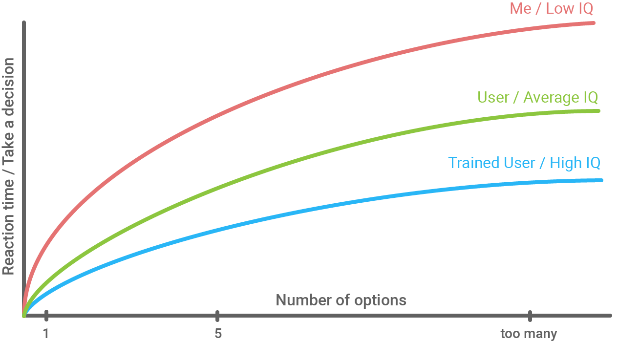
Hick’s Law states that the time and effort that it takes to make a decision increases with the number of options:
Good UX design that is aimed at bringing in conversions should avoid presenting viewers with too many options to choose from. This is most true when it comes to designing the pricing page of your application. While customizing the options to meet the unique needs of a variety of users may feel like the right thing to do, presenting them with multiple options is actually counterproductive in nature.
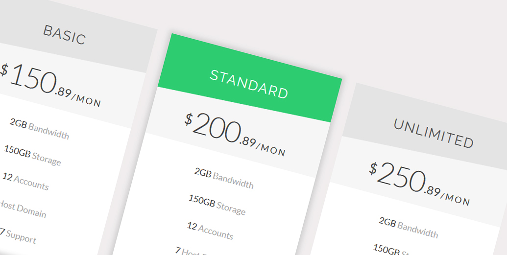
The number of options should ideally be no more than two or three. Giving just two choices makes decision making easy. Three choices can be given in case you plan to utilize the decoy effect. The psychology behind this is that when presented with two alternatives, one higher priced and other lower priced, customers tend to go with the lower priced variant. But with a third choice that is an asymmetrically valued option, the human instinct to score a better deal propels customers to choose the middle option, not the lowest one.
So with two choices, $150 and $200, most people choose $150. But if you add a third choice of $250, most people pick $200:
The second option is merely a decoy aimed at pushing the users to choose the third option. The most recent real-life example of this pricing methodology was when Apple unveiled the iPhones 8, 8+ and X together, in which the former two were meant to be decoys for boosting the sale of iPhone X.
10) Test and Measure the Results
The effectiveness of your website design and the changes being made cannot be ascertained unless you test your hypothesis and measure the results. A/B testing of the various design elements and measuring the effectiveness of each change against the other will help you choose the option that best meets your needs and brings in maximum conversions.
Making use of psychology and understanding the drivers and inhibitors behind users’ actions of finally converting can help you achieve your business goals in a more effective manner.
Your business goals must align with your customers’ needs, and your website or mobile app should focus on fulfilling those needs by solving their problems. This strategy not only helps you drive more conversions, but it also has a direct impact on the profitability and success of your business venture
Dive Deeper: How to Run A/B Tests that Actually Increase Conversions