Building a decent e-commerce store is easy, but growing a successful e-commerce business is much harder.
To develop a rewarding e-commerce business, you need a web store built on the fundamentals of experience, know-how and constant improvements over time. It’s the same as running in a marathon: you need to carefully prepare so that you don’t run out of fuel in the middle of the race.
E-commerce store design is one such preparation. Compromises on the design aspects may cause both immediate and long-term effects. It doesn’t matter if you rely on an e-commerce store builder, a marketplace script, or developing the store from scratch, you will always go through the website designing phase. Sometimes you need to revamp the whole thing, while other times a little tinkering on the color scheme does the job.
Modern e-commerce website design is not just about offering a great user interface (UI), but also great user experience (UX). It goes way beyond the artistic beautifications and incorporates business goals and heightened user satisfaction.
So how do you design an e-commerce store that entices customers and removes the hurdles to your conversion funnel?
Be it website design, a mobile app, a landing page or just an ad banner, web designers follow certain fundamentals that create an an easily navigated path to the product, for the target audience, and within your marketing plan. This article aims at explaining these four basic fundamentals.

1) Fundamentals of Adept UI Design
UI design trends tend to be rather volatile. They come, stay for a while and then suddenly disappear for good. However, when choosing a UI design for your web store, rather than paying attention to the latest trend, you should focus on the most important factor in every e-commerce store: trust factors.
How to Showcase Trust
Be it an e-commerce store or even a physical shop, customers purchase when they trust your business. If they find that your website has bugs, design flaws, or seems even a little bit suspicious, they will waste no time hitting that X icon to close the window. So how can you instill trust factors in your e-commerce store design?
You can do that by incorporating three major trust indicators. Integrating these components will let your customers know that they are buying from a real person, instead of just a faceless brand, who is accessible and answerable if things go wrong.
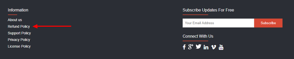
A) Clearly Display Your Contact Info
A dedicated section on your store that displays your contact information is not just a design component but a necessity for any business. Nothing will make customers bounce back to the search engines more than a missing ‘Contact Us’ tab. A little difficulty in finding your contact information, and whoosh! You lose a potential customer.
There are three ways to integrate contact information:
- Ensure a dedicated section (tab) for listing all your contact information. Include an email address for certain, and if relevant, include the contact phone number and physical store address. You can improve this section further by incorporating advanced contact options like Live Chat, Ticket Management System, and links to your social media channels. Do not display your email or contact number as a brand; humanize it with a real person’s name:
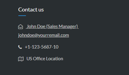
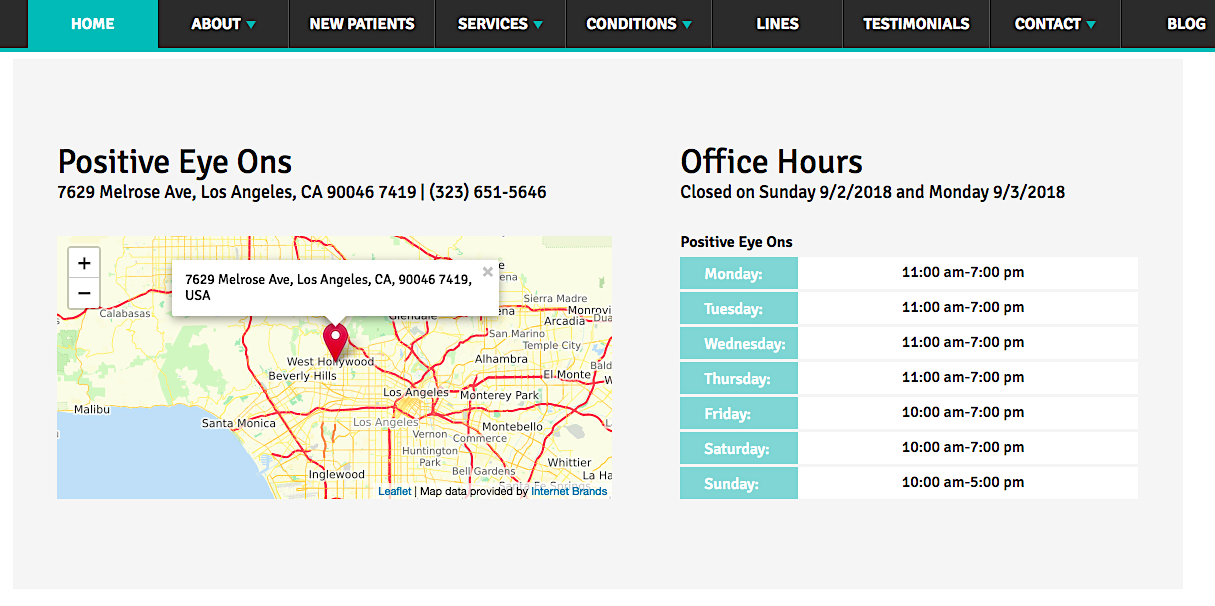
Tip: You can integrate Google Maps on your website to show the GPS location of your physical office, like this optometrist, Positive Eye Ons:
- Dedicate a small space on the homepage header or footer and show your contact information directly. You can include an email address and contact number.
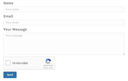
- Integrate a simple ‘Contact Us’ form (if you ask for too much info, people will hesitate to reach out), with a Captcha:
Learn More:
- 7 Mistakes in UI and UX That Are Costing You Engagement
- Making Data-Driven Decisions for Better Website UX
- 3 Keys to Updating Your Website for Optimal User Experience
- 8 Absolute Best E-commerce Website Builders
- How to Create an Ecommerce Website Step by Step
B) Have a Clear Return Policy
A clear return policy helps eliminate any confusion or second thinking because it lets customers return the products if it does not satisfy them. When confronted with a non-returnable item, especially when it’s a more expensive product, many customers will opt for another e-commerce site that allows them the peace of mind, a.k.a. trust and confidence in the site, to easily return those products they don’t like.
A competent e-commerce store builder or marketplace script offers strategic ways to highlight your return policies and return process UI.
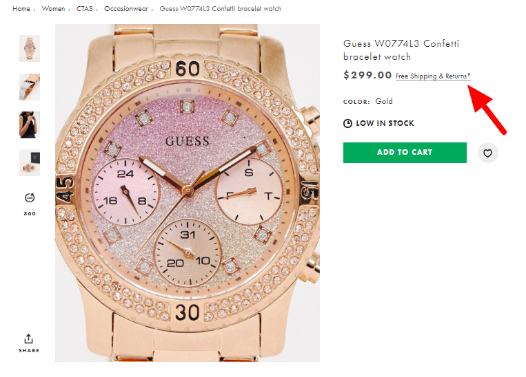
- Showcase your return policy on every page in highlighted sections like the footer, header and product pages:
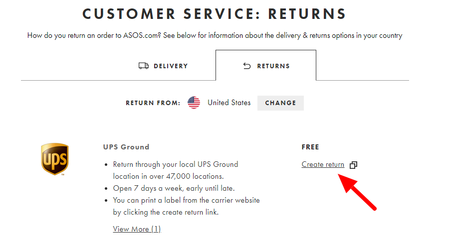
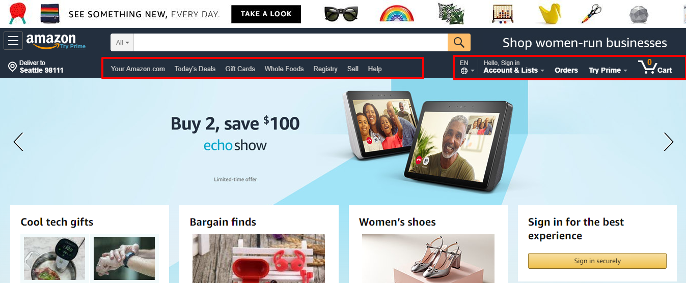
- Showcase unambiguous navigation to the return procedure interface. You can do that in two ways. With independent UI for signed-out users using the order number:
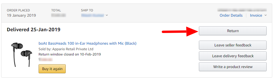
- Or navigation from logged-in users in the ‘My Orders’ section, like Amazon does:
C) Exhibit Your Trust Seals
Security indicators are the trust seals you need to display on your e-commerce store. These seals come as visual badges to showcase the security and safety of financial transactions and there are various payment gateway integration options. Other seals you can display are the badges of antivirus software, secure web hosts, and SSL certifications:
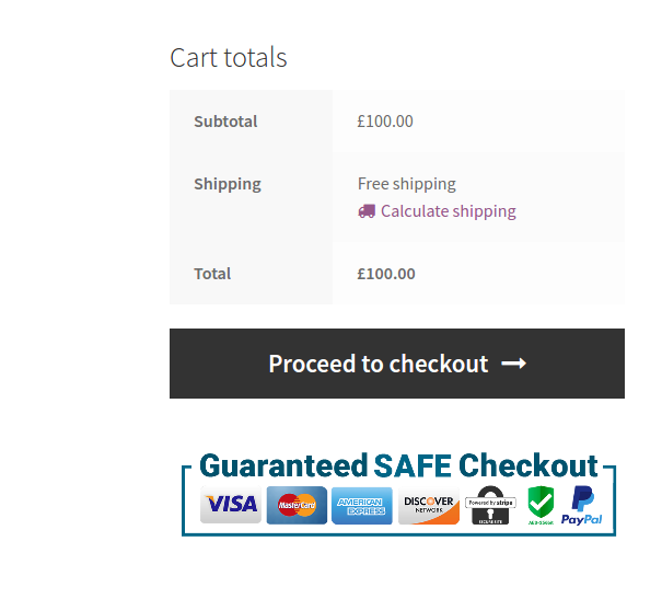
These trust indicators are particularly handy when your store is new and you have no customers yet. Put these trust badges in strategic places to be sure that every potential customer sees them, including:
- Website footers
- Checkout pages
- Payment pages
- Product pages, etc.
2) Fundamentals of UX Enrichment
The user experience is totally a phenomenon of perception. In other words, users establish a perception, or an opinion, in the first few seconds of landing on your site. In addition to various other aspects of UX enhancement, that also means visual appeal.
People base the majority of their first impression on the visual appeal that your site has (or doesn’t have). It can impact whether they see your site as professional with high-end features or as an amateur site with silly beautifications. To give the best UX to your customers, you need strategic placements of high-quality images on your site.
From the banner to the menu of categories, from the product description to the entire product page, you need a professional approach to your images. Here are some key tips you should follow in the design of your website:
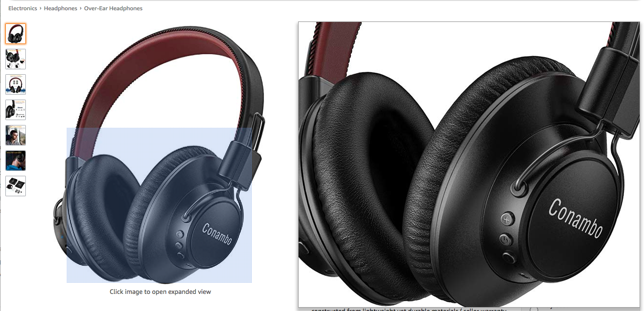
- Allow multiple product images with multi-angles
- Integrate a product image zoom feature to offer a more in-depth view (Amazon is particularly good at this):
- Use clear, studio-quality product images
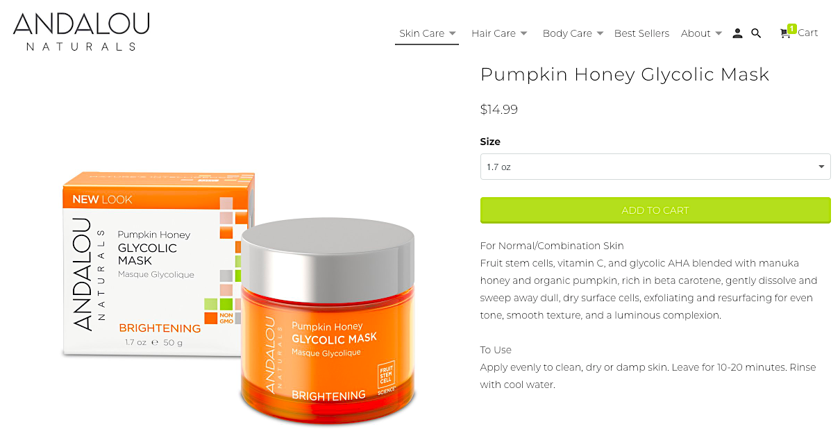
- Use a white background for product images to get sharper details, like this Andalou facial mask product:
- Include lifestyle images in addition to the white background product images
- Use a color pallet that matches your website’s color scheme
- Do not use more than two colors in the primary color scheme
- Do not use skewed images; maintain the expected ratio
- Use professional fonts that do not look cluttered
- Use CDN delivery for HD images to prevent a sluggish page-load speed
- A/B test to find the best contrasting color schemes for CTA buttons
Learn More:
- How To Create CTAs that Actually Cause Action
- 5 Important Landing Page Elements You Should Be A/B Testing
- Top 10 User & Customer Feedback Tools to Improve Conversion
- 6 Tips to Combat Cart Abandonment on a Magento E-Commerce Store
3) Fundamentals of Mobile Support
Mobile is no longer an option when it comes to business websites. It has become a necessity of UX optimization as well as e-commerce SEO. There are three reasons for this:
- Just over half of Internet users use their mobile phones to browse sites:

- People hate it when sites do not optimize for mobile viewing. In fact, 61% of mobile users won’t go back to a website if they had trouble accessing it and 40% will to go a competitor’s site instead.
- 57% of Internet users won’t recommend a business with a poorly designed website on mobile.
- If you still think this doesn’t matter much, you should know that smartphone conversion rates are up 64% compared to desktop conversion rates.
- Even Google encourages mobile responsive sites in its SERPs with its mobile-friendly update of 2015 that prioritizes the ranking of mobile-friendly pages:

However, most e-commerce sites are developed on a desktop-first approach and do not optimize them for mobile viewing. And as a result, they are losing a lot of sales.
How to Make Your Web Store Mobile Friendly
There are two ways to achieve this:
- Launch a mobile app for your website
- Make your site mobile responsive
The first approach depends on your investment budget. However, you can make your website mobile responsive in three ways:
- Port the existing website to mobile. Port your static web-shop to the mobile-responsive architecture (here’s a great article that can walk you through it.). It will require a lot of additional coding in the UI design.
- Mobile first development. Develop your mobile site first and then port it to desktop architecture. This is suitable for new entrepreneurs looking to develop their sites.
- Develop each separately. Develop your mobile and desktop sites separately and host them on different domains and sub-domains, such as yoursite.com for desktop and m.yoursite.com for mobile. This option is suitable for both new and old entrepreneurs with existing sites.
Related Content:
- Your E-commerce Sales Chore Chart for a Profitable 2020
- How to Improve E-Commerce Landing Pages with Paid Ads Data
4) Fundamentals of Easy Navigation
The only fundamental of easy navigation design is ensuring that users can find products and other content quickly. A flawless navigation boots the user experience – and sales! The architecture of the navigation totally depends on the theme you choose for your e-commerce store builder or marketplace software.
Choose a theme that makes the flow easy and flawless right from the homepage with these tips:
- Navigation controls: Guide users to your conversion funnel from the homepage. Set navigation shortcuts in one of the following two ways:
- Embed categories and other menus on the top header menu for desktop websites
- Embed categories and other menus in the left side-bar for mobile websites and apps
- Menu items: Strategically select the menu items to be highlighted. Embed at minimum these menu items for easy navigation:
- Shop [All Product Categories]
- Featured links: Bestsellers, today’s deals, link to profile, etc.
- About Us link
- Policies links: Return, shipping, affiliate, etc.
- Contact Us page link
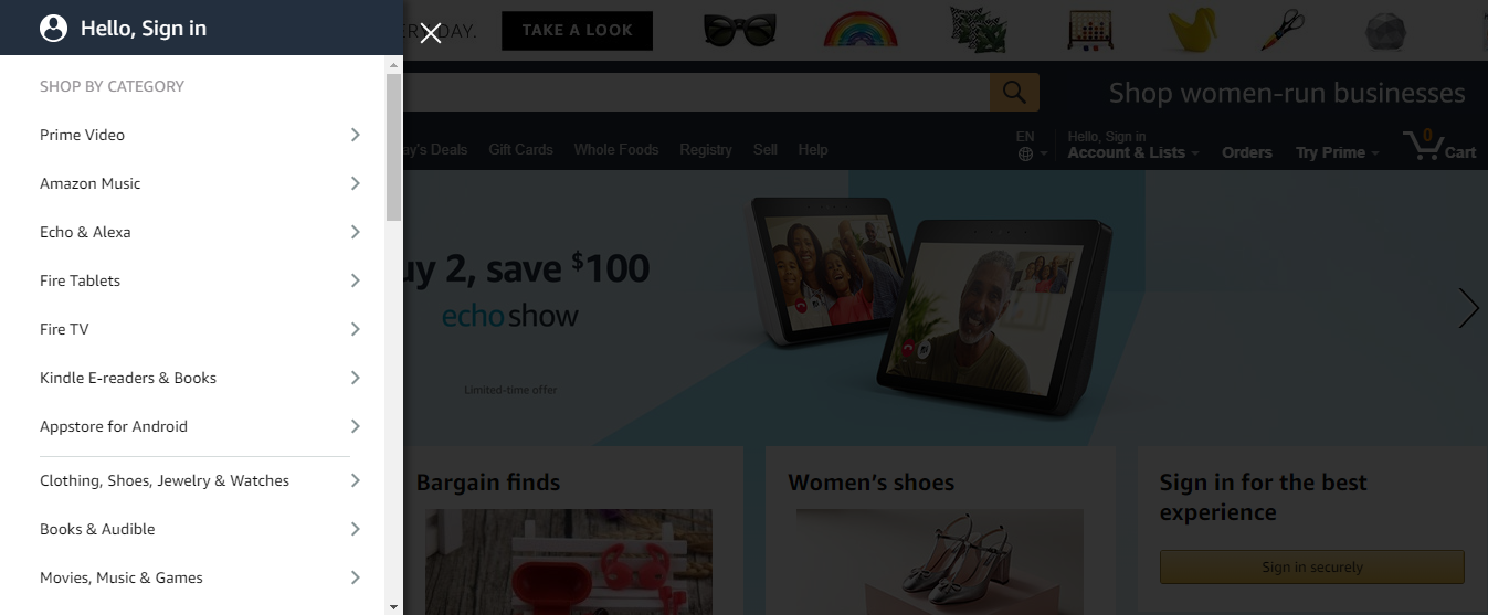
I am a fan of Amazon’s navigation panel. They not only place the featured links strategically, but also dedicate a whole left side-bar for product categories:
In Conclusion
You cannot achieve a perfect e-commerce store design in one sweep. You need a more continuous and evolutionary approach. Follow the above fundamentals in each evolutionary stage of your web-store. Track the trends, A/B test the experimental designs, analyze their effects on your conversion rates, and then select a perfect modification. The best design always includes some of the latest trends and all the best browsing habits.


