5 Important Landing Page Elements You Should Be A/B Testing
Landing pages are your ticket to converting your web traffic into qualified leads.
Creating a fully functional website takes significant time, money and resources.
So when you are done, what’s the next step?
PPC ads, e-mail marketing and social media should top the list — but what happens after visitors click on your PPC ad or an offer you have on social media and are directed to your company’s landing page?
Remember: Driving leads to your website is the easy part, but once they land there, you need to work hard to convert them into leads.
The Importance of A/B Testing (or Split Testing)
You only have eight seconds to grab your audience’s attention.
To determine which combination of landing page elements is most successful at converting prospects to leads, all digital marketers should be experimenting with A/B testing.
This tried-and-true practice has helped many marketers learn what their target audience best responds to and continues to be the most effective way to improve conversion rates.
Despite that some online marketers argue that it’s ineffective and a waste of time, landing page A/B testing is an excellent way to improve your landing page.
To demonstrate the power of A/B testing, here are a few proof points:
- Moz generated a 52% increase in sales of its Pro membership.
- Lumineers increased conversions by 120% resulting in 1,200 more leads in one month.
- 71% of brands that had large sale increases tested multiple landing pages first.
Marketers who know what they’re doing don’t leave their success up to chance. They implement A/B testing in order to evaluate which elements produce a higher conversion rate.
Learn More: What Is A/B SEO Testing? – Single Grain
Which Elements Should You A/B Test on Your Landing Page?
Every landing page element is important. However, there are a few pieces that should be A/B tested, especially when you first publish your page and start generating traffic. The following list includes five popular elements you should A/B test that can significantly increase conversions.
Test Your Headline
Your headline is one of the first things visitors will see when they land on your page, so it makes sense to test this element. It also helps create that important first impression for your audience — will they stay and see what you’re offering or leave and never return?
A headline that doesn’t immediately grab your audience’s attention can kill your conversion rate and make all that time, money, and effort you invested go right down the drain.
To demonstrate, L’axelle initially wrote a comfort-oriented headline, against which they tested an action-oriented headline:

The results? The action headline (“Put an end to sweat marks!”) earned them a 38.3% conversion rate, which was 93% better than their control page.
This example is not to say that action headlines will always outperform other variations. It simply means that for L’axelle and this test, an action-oriented headline was more appealing to their visitors and thus helped generate more sales.
Test Your CTA
Your landing page may be creative, unique, and professional, but that doesn’t guarantee conversions. You still need to guide your audience toward your desired action: the CTA button.
The most important element on a landing page is the CTA because that’s what a user must click to redeem your offer. The size, color, and positioning of the button, plus how many CTAs to include all play a part so your it must be attention-grabbing.
Centraal Beheer Achmea, a top-tier Dutch insurance company, created a landing page to promote insurance services for entrepreneurs. On the page, they tested whether including a link below the CTA would increase the click-through rate of the offer or not.
Variation A (first screenshot below) has a CTA that translates to “Configure your package now” with a hyperlink beneath it that says “Share this on LinkedIn.” Variation B (second screenshot below) has the same CTA but no link beneath it.


The results? You may think variation B was the winner because it gives users only one option to click on: the bright orange button. But by including the second link, Centraal Beheer Achmea saw a 244.7% increase in clicks on the orange CTA.
Again, this does not mean that all A/B tests that involve additional CTA links on your landing page will produce better results. It simply means that in this case, variation A with an extra link performed better.
Learn More: How To Create CTAs that Actually Cause Action
Test Images vs. Video
Images are important for landing pages but videos can be even better at persuading prospects to convert. According to Crazy Egg, people who watch a video about your product are as much as 85% more likely to purchase.
If you have yet to A/B test images against videos on your landing page, you might be missing out on conversions. Including video is a way to offer a more detailed description of your product or service, as well as a way to further engage visitors for an extended period of time. Of course, your product demo or explainer video must be compelling and of high quality.
In this case, Sprout Social wanted to see if a screenshot of the product on a laptop (variation A) or a product demo video (variation B) would produce more conversions.
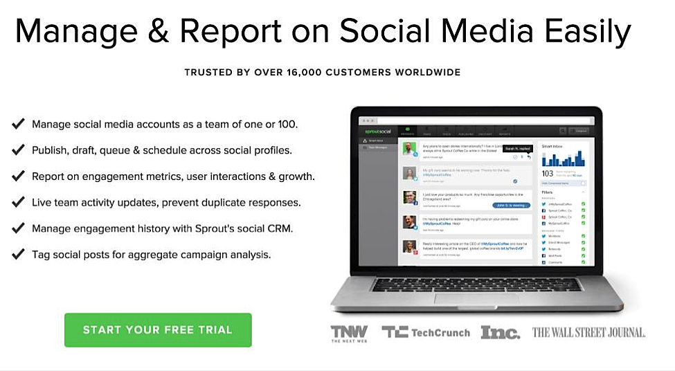
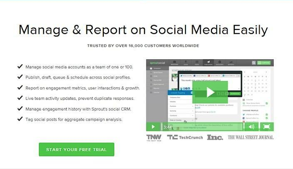
When testing an image versus a video, you must know your audience and be aware of the possible impact of both. In the example above, the landing page image may have outperformed the video because the target audience consists of senior citizens who are not as likely to be video savvy.
Read More: The Ultimate Guide to Video Marketing
Test Your Form Fields
When you design your landing page, determining how many form fields to use can be tricky. It can be one of the biggest friction points of your entire page because, naturally, people want to protect their personal information whenever possible and will hand it over only when they decide that the offer’s value is worth it.
A form with too many fields can be daunting and you might scare your prospects away. On the other hand, you might find that your audience is invested in your offer and will gladly provide their information. Therefore, A/B testing as to how many form fields to use, and what kind of information you’re requesting, is crucial.
Many marketers don’t want to give up valuable customer information, so create a form with all the fields you want and then test it by removing first one, then two, then three, etc., fields. You can also try spreading out the high number of fields across more than one page, with three, for example, fields on the first page and another three on the second page.
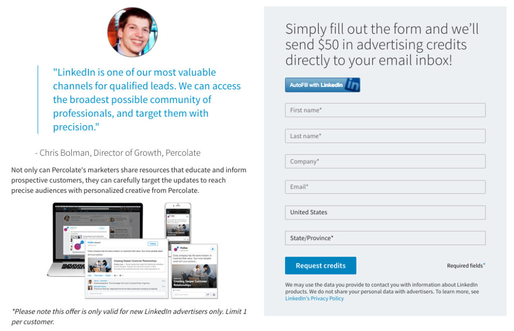
Take these two good, but different, examples from LinkedIn and Geico.
LinkedIn offers $50 in advertising credit just for completing the form. Even though all fields are required, the form is relatively short and the offer is attractive enough to likely persuade many digital marketers to redeem the credits.
Geico’s landing page form, on the other hand, is a multi-step form and is very short:

Inputting a zip code will take prospects to the next step where more personal information is requested, such as address and date of birth. The orange CTA button contrasts well with the page and makes it very clear what will happen next. Anyone who visits this Geico landing page is naturally looking for car insurance, and by offering such an easy way to start the quote process, Geico will likely have a high click-through rate.
Test Your Layout
Testing apples versus oranges is a good way to start testing your landing page’s layout. Create several landing page variations and use the better-performing version to conduct further split tests.
For example, this Highrise A/B test offers the same information, but variation B also includes customer testimonials and ten bullet points as to why Highrise can help your business:

The results? Less is more.
The long-form design (variation B) performed 22.72% worse. This particular layout test shows that when presented with too much information, visitors may not scroll to see what lies below the fold or they may simply feel overwhelmed and neglect to convert.
Learn More: Why You Should A/B Test Your Brand Color
Final Word on A/B Testing
If you want your landing page to serve as a well-oiled conversion machine, it’s crucial to A/B test even the smallest of details. There is no one-size-fits-all approach to A/B testing, but if you start with these five elements it will help you optimize your landing page and convert more of your traffic. After all, you can conduct A/B tests in as little as ten minutes per week.
Need help A/B testing your landing pages or other copy? Request your free marketing plan from Single Grain. 👇