Marketer’s Guide to Landing Page Optimization
Landing pages are your customers’ online portal to your brand and an efficient way to convert your web traffic into qualified leads. That’s why it’s one of the most popular topics in digital marketing. In fact, entire books have been written on this subject.
A landing page is your chance to make a strong first impression with potential customers – but if it doesn’t go well, it could be the last chance you get to make any impression whatsoever.
In this guide, I’ll show you how optimize your landing pages so that the first impression site visitors have of you goes a lot better than the time you tried to impress your high school crush…
Let’s get started!
What Exactly Is a Landing Page & Why Are They So Important?
Marketers use the term “landing page” all the time. But it’s worth taking a moment to clarify just exactly what we’re talking about here.
A landing page is any page to which visitors arrive from an external source. It is, quite literally, the page your customers “land on” first before (hopefully) obeying your call to action and/or exploring your website further.
The source could be from anywhere aside from an internal link on your site. It could be a pay-per-click ad you’re running, a link from some other company’s blog, or even a direct URL they type in.
Technically, this means that any page can be a “landing page,” even your homepage. But generally, when the term is used it implies those pages to which you are actively sending traffic, like this Airbnb landing page:
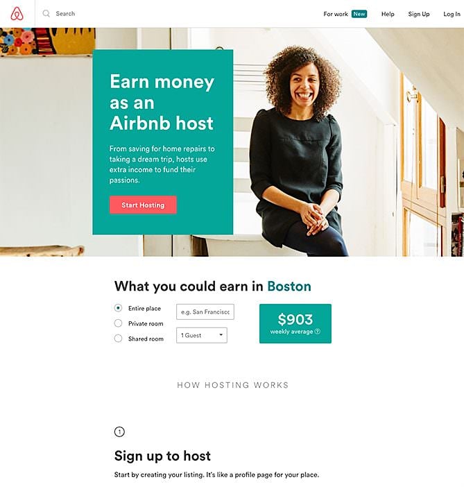
Great landing pages are targeted and focused on a singular goal such as e-mail sign up, requesting a quote, or completing a purchase.
That’s why you should never use your homepage as a campaign landing page – it usually has way too much going on. It isn’t clear to visitors what they should do next, and it certainly isn’t targeted to a specific sub-group of potential customers.
By paying attention to who is landing where on your site (and where from), you can tweak your landing pages to appeal more specifically to those types of visitors.
The key to building a successful landing page is knowing your audience and catering to those people. Share on XAnother key fact that many people seem to ignore is that customers will probably interact with more than one landing page throughout their journey with you. You’ll want different landing pages for different stages of your funnel, with different goals.
You might start by offering a free e-book or PDF in exchange for their name and e-mail, but eventually you’ll use that e-mail to direct them to more landing pages, possibly collecting more information and ultimately trying to close a sale.
Pre-Qualifying Traffic
One of the key elements to landing page success is pre-qualifying the traffic you’re sending there as best you can.
If the people arriving on your landing page aren’t interested in what you’re offering, their behavior isn’t a very reliable source of information about your landing page’s success.
For example, if you send a new photography hobbyist to your landing page for your $2,000 professional photography course, they’re probably going to leave without looking much further. What’s worse, if you also offer free beginner lessons further up your funnel or a lower-priced product that matches the newbie’s current needs better, you’ve just given them the wrong impression of your brand.
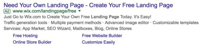
The easiest and most important time to qualify traffic is when you’re paying for it through paid advertising. Not only can bad leads skew your landing page statistics, but they can also cost you a lot of money in useless clicks.
That’s why in addition to following pay-per-click best practices, it’s important that your ad is focused and filters out those who can’t or don’t want to pay for your offer. This Wix ad is a great example of qualifying your leads by offering specific service options:
As mentioned before, though, paid advertising isn’t the only way you can drive traffic to your landing pages. Another great technique for existing subscribers is effectively segmenting your e-mail list.
Segment people based on which products they’ve shown interest in and at what stage of your funnel they are: send newer subscribers to pages with free content to strengthen your relationship, but send people who are ready to make a purchase decision to your more salesy landing pages.
Learn More: PPC 101 – What Is Pay-Per-Click Advertising?
Momentum
When it comes to conversions, the most important factor to keep in mind is momentum.
Merriam-Webster defines momentum as:
“Strength or force gained by motion or by a series of events.”
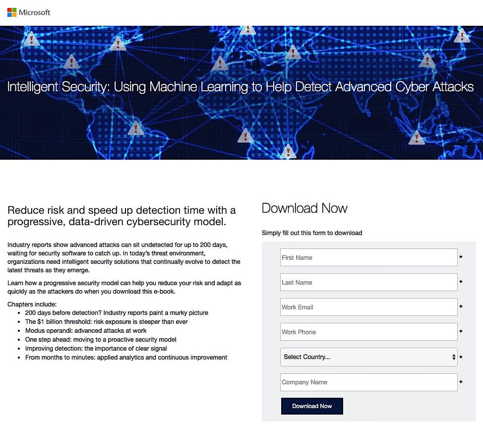
In marketing, that series of events is everything that leads up to the moment of conversion (or abandonment). And to maximize your conversions, you must make sure that those events are all lined up and in sync in order to build on that momentum. That is why it’s essential that your landing page matches your initial offer in both content and design, like this one from Microsoft:
Obviously, you want to deliver on your promise. If your ad says you’re offering a free 30-day trial, nothing will generate more bad faith than offering something different, like a 14-day trial, on your actual landing page.
But you need to look at even more specific details. If you told a segment of your e-mail list that they can download a free e-book by following a link, don’t start calling it a PDF once they arrive.
It may be the same thing at the end of the day, but in order to maximize your momentum you need to make sure that your language is as congruent as possible. Use exact phrases at every step whenever it sounds natural.
You should also take care to keep a consistent look and feel. Unless you’re using AdWords or some other text-only marketing strategy, you’ll want the graphics and color palette of your landing page to match your promotion.
For example, if you have a partner promoting a new product that you’re launching on their site, you should consider giving them a custom landing page with their logo and branding next to yours so that customers are smoothed into the transition.
This landing page works whether the traffic comes from HubSpot or LinkedIn:
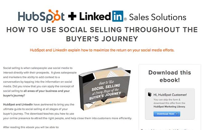
Even though they are now on your site, buying your products, including this consistent branding maintains the trust they had with the brand that referred them and keeps them comfortably moving forward.
Momentum doesn’t stop once the visitor arrives either. Chances are, this first conversion isn’t your ultimate goal. You should apply your branding or theme in your thank-you page and follow-up messages, too.
Design
Now that you’ve got qualified traffic and understand the concept of conversion momentum, we can talk about how to design the actual page.
Rule #1 – Less Is More
Ideally, a landing page should fit above the fold; if not, the key points and call-to-action should be visible without requiring the user to scroll down at all.
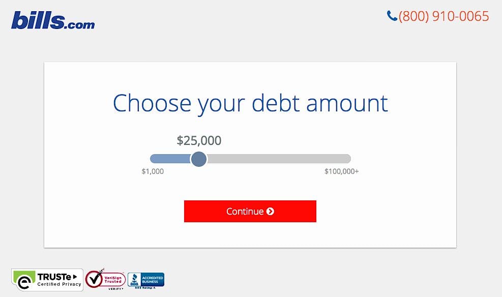
With this limited real estate, it can be tempting to cram a lot of information onto the page, but actually you should be doing the opposite. The best landing pages say what they need to in a minimum of words, like this one from Bills.com:
Don’t be afraid of white space. With fewer pictures, bullet points and words cluttering the screen, the important things like your call to action will pop much more.
Rule #2 – Have One Clear CTA
Some of the most effective landing pages give customers just one option: convert or leave. They don’t offer links to other pages on their site such as “About Us” or “Products and Services.”
If you properly qualified your traffic, you should know what they’re after and should offer that to them. Don’t force them to go looking around your website for the answer and then abandon your site out of frustration, like this Jobsite landing page (before they improved it):

This strategy works best if you can qualify your traffic well. But if you can’t, try providing them with self-qualifying options, like asking them what industry or profession they’re in to make sure you know where they fit into your marketing mix.
Either way, the CTA should be the focus of your entire page because, after all, it’s how you’ll measure your success. Use contrasting colors to make the CTA button as well as what the visitor will get stand out from the rest of the page.
Keep in mind that many Internet readers have a short attention span, so you want them to be able to identify what you’re offering and how they can get it without having to read through the entire, text-heavy page.
Learn More: How To Create CTAs that Actually Cause Action
Rule #3 – Reduce Friction
Friction is anything that discourages a visitor from completing your call-to-action.
Common examples of this friction are asking for too much personal information before they know and trust you or taking up too much of their time before giving them what they want.
You need to reduce this friction.
Sure, it would be great to know you customer’s name, e-mail, hobbies, age, income, marital status, social security number, and favorite food. That level of detail would help you build some very powerful buyer personas and customer segments. But it’ll also probably result in significantly fewer people converting.
You need to ask yourself: “What information do I absolutely need to get from a lead to effectively nurture a relationship with them?”
Remember, at this point the goal is to get your foot in the door and start a relationship, not ask them to marry you on the first date. You can always collect more information from them later.
While a credit card company may legitimately need to ask you about your income level and social security number, for many situations, all you really need is their e-mail address.
If your landing page is a little broader, and you sell different products or tiers of service, you may want to add an additional question to help you segment leads, such as “What is your average monthly ad spend?”
If you really do need to ask for a lot of information, you can mask it by breaking the form across multiple pages. Start by asking the customer for their name and e-mail on your landing page and then direct them to a follow-up form which asks for additional info.
Trulia applied this strategy by starting with a simple ask before any diving into the details:
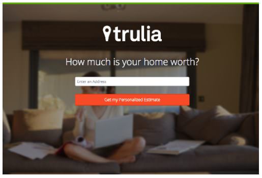
Once the visitor clicks that big orange button, they are then asked for some personal details:
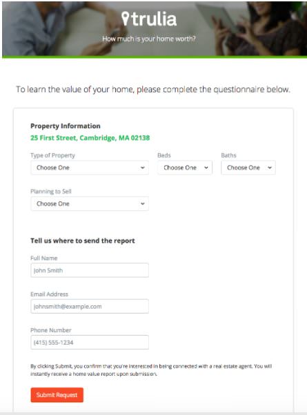
This strategy works by leveraging conversion momentum and is an age-old sales strategy applied to the web. Get your customer to perform small micro-conversions, deliver a positive experience, and they will be more likely to complete further conversions as well.
Just don’t abuse this or you will annoy visitors and leave a bad impression.
Writing Your Landing Page
So you’ve got traffic and are designing your page with conversions in mind, but what kind of things do you actually write on a landing page?
There are three main content sections on a landing page: Headlines, Body, and Call-to-Action. Share on XSection #1 – Headline
Your headline is extremely important because it’s what the visitor uses to determine if they’re interested in your page at all. If your headline doesn’t grab them, it doesn’t matter how epic your copy is, because they’ll never see it.
A strong headline reinforces the promise you made that brought them to your landing page. You also want to raise excitement. You did or said something that made them curious about your company or product, so now you need to nurture that excitement.
While the absolute first thing you need to do is restate the offer, you can follow up with subheadings or section headings that also highlight the #1 value proposition you’re offering.
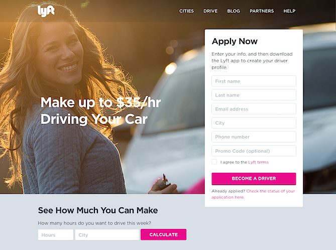
While this Lyft landing page does break my one CTA rule, it makes excellent use of headlines:
Lastly, make sure your headline is crystal clear. Many of us, myself included, love to craft those witty, wordplay headlines to stand out, but that can be a dangerous habit if you put more emphasis on being clever than being clear.
Remember, landing pages are usually someone’s first experience with your offer. So clever titles are fine, but only if they’re also 100% clear.
Learn More: How to Write Content for People and Optimize It for Google
Section #2 – Landing Page Body
In the landing page body, you want to emphasize the main benefits that the customer will get from completing this call-to-action.
You can summarize what’s included in the offer (“our 12-point checklist for your next winter camping trip”) but you need to let the readers know how that will benefit them (“so you stay safe, warm and cozy on your adventure”).
Also, keep the content focused on the current CTA. You don’t need to pitch yourself or your brand unless that’s directly relevant to the offer, such as establishing expertise for a webinar you’re hosting.
This section is usually the least important. For most low-friction conversions like e-mail subscribers, it may be almost completely unimportant. For sales pages, you may want to put a little more effort into them while still prioritizing the headline and CTA.
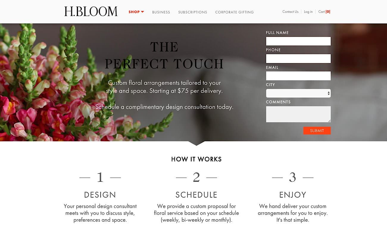
Compare these two pages. The first landing page copy, from H.Bloom is simple and short, to match the service.
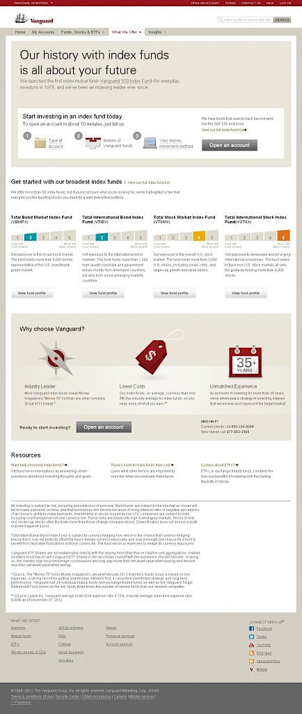
The second one, Vanguard’s landing page, is a bit more detailed, which matches the level of expertise that customers are looking for.
Section #3 – Call-to-Action
The CTA is the punchline, the goal, the entire reason we’re doing any of this.
As we talked about in the design section above, your page should be centered around the CTA. Use bold colors that stand out and clearly label the button. Keep the area around it free from clutter or distractions.
Keep your wording here short and punchy. Hopefully, you’ve built up momentum and now all you need to do is get your landing page visitors to take the leap.
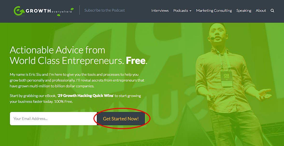
Clearly label the button so that people are reminded exactly what they’re getting. It also helps to use strong action words like get, download, or start coupled with urgency words like now or today, like this example from Growth Everywhere:
 You should also clearly label any form fields so that there’s no confusion about what they should do. For example, if you’re selling a B2B software product, you may want to ask for their work e-mail specifically.
Your CTA should do nothing but encourage people to click on it.
Learn More: How to Use Scarcity on Your Landing Page to Skyrocket Conversions
Putting It All Together
Now you have all the tools you need to put together a killer landing page that converts. Of course, you probably won’t nail it on your first try. Don’t worry, none of us do.
Take the time to track your conversions and test the impact of changes with A/B tests. Just make sure to test one thing at a time so you can accurately discern causality. And don’t go overboard.
Spending 10 hours testing every possible color combination is not the best use of your time. When testing changes, make sure to do it with a purpose.
Optimization is always an ongoing process as we learn more about psychology and develop new technology and tools. If you want more ideas to take your landing page to the next level, check out our latest conversion tips!