Data-Backed Best Practices for Building a Killer 404 Page
The 404 page is probably one of the most overlooked and underappreciated pages on most websites. But don’t let its unassuming nature fool you. The 404 page serves some very important purposes, such as reducing bounce rates, avoiding SEO penalties, improving navigation and maintaining customer approval.
Not sure yours stands up to important goals? Here are some guidelines based on anecdotes from leading brands that can help you craft a well-optimized 404 page and provide a stronger user experience.
TABLE OF CONTENTS:
Why Are Unique 404 Pages Important?
According to 404 Lab, the first 404 page originated in the 1990s and is credited to Tim Berners-Lee, the founder of the WorldWideWeb browser. The original 404 page successfully communicated to readers that they stumbled onto a wrong page, but didn’t do much else. It was static and non-engaging.
A page with a white background and text saying “404 Error: Page Not Found” may have been sufficient in the early years of the Internet, but user expectations have since evolved significantly. People expect a seamless user experience, which is why there’s nothing more frustrating than stumbling onto a 404 page. Users who hit this page on your site may very well click the back button or simply leave your site altogether.
A clever and well thought out 404 page is critical for damage control if readers come across a broken link or a page that’s been taken down. Use it to mitigate their frustrations by making the page interesting or entertaining. Doing so will increase the likelihood that visitors will stay on your site and give you an opportunity to provide them with additional resources that could ultimately result in conversions for your site.
Creating a unique 404 page can also be important for SEO. Most people avoid having their 404 pages indexed so that it won’t cause their sites to be penalized for thin content. However, a poorly functioning 404 page can still hurt your site’s SEO for other reasons. Since Google is monitoring user experiences more carefully, you’ll want to minimize your bounce rate and increase the average user time on site.
People often leave websites as soon as they see a generic 404 page, which can, consequently, have a negative impact on the site. The impact will be even more noticeable if you have a lot of broken links on your site or if you’ve taken down a lot of your content. While this indicates that you have other issues to resolve to avoid damaging the user experience, it also illustrates the importance of creating a nice 404 page for your visitors while you work on providing a crisper experience.
What Can You Do With Your 404 Pages?
With all these benefits in mind, it’s no surprise that marketers have started becoming much more creative with their 404 pages in recent years. There are several different strategies that you can follow to better position your website to your viewers. Here are a few of the most common approaches you’ll want to consider:
Entertain Your Viewers
Many websites have found ways to make their 404 pages more engaging, which can be a great way to improve visitors’ perception of your company and keep them from leaving your site. You can use humor, offer entertaining images or provide interesting information that will prompt them to continue searching your site.
However, you need to make sure that any humor or entertaining messages you use are consistent with your brand. As you will see in some of the examples in the following section, humorous messages work very well for brands that have a more casual relationship with their followers. However, websites like Wikipedia need a more straightforward 404 page, as their visitors will likely have a more serious outlook while browsing the site’s encyclopedic content.
Offer an Option to Communicate With You
Your visitors likely stumbled across your 404 page as they were looking for specific solutions to a problem they were facing. It’s possible that the information was accidentally removed from the site or is located somewhere that they won’t be able to easily locate. There’s also a possibility that the information that you have posted still won’t answer their questions.
As a result, it may be helpful to use a call-to-action on your 404 page to encourage these viewers to contact you. They’ll feel more connected to your brand and will be more willing to reach out to get the information they need – rather than turn to your competitors.
Provide Different Navigation Options
There are a number of different reasons that will cause people to end up on your 404 page. Unfortunately, it’s nearly impossible to figure out what every individual was looking for in order to to provide feedback to their problems. However, you can still offer some general guidance to help them find it by creating a variety of navigation options to make their search more convenient. Go above and beyond what’s included in your standard navigation bar and you’ll find that even lost visitors will remain on your site longer.
Examples of Amazing 404 Pages
Ready to put these principles into action on your site? That’s great! The best place to start creating the perfect 404 page is to study examples from other successful marketers. Here are a few great options to use as a starting point:
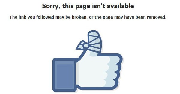
Facebook is the second most popular website in the world and has amassed a regular base of nearly 1.4 billion users with its exceptional UX strategy. The Facebook User Experience Lab recognizes that even a seemingly mundane page, such as a 404, has the ability to shape the way users interact with the site, which is why finding a clever way to make the page more interesting was a top priority for the team.
The Facebook 404 page is simple, but also original. Beyond the text that reads, “Sorry, this page isn’t available. The link you followed may be broken, or the page may have been removed,” the page is distinguished by a picture of the Facebook thumb icon with a bandaid. This image works well, as everyone is familiar with the Facebook “Like” icon and its use on the company’s 404 page represents a witty play on a traditional concept.
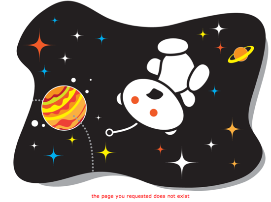
Reddit is known as “the Front Page of the Internet” for providing a massive number of people all over the world with a place to hang out and share information. And since the site has so many web pages, it’s not uncommon to find posts that include links to content that’s been removed and that lead to the occasional 404 error.
The site appeals to people of many different interests and backgrounds, but it’s especially popular among gamers and those that are interested in science. As a result, it should come as no surprise that the company’s 404 page has been designed to aligns with the interests of these core demographics.
The 404 page shows Snoo – the alien mascot of the Reddit community – floating in space with his mouth gaping open. Since Snoo is an iconic part of Reddit, the company tries to include him on every page on the website – and the 404 page is no exception. Including him here makes the user experience more consistent and gives regular users the “insider appeal” they crave.
Mozilla
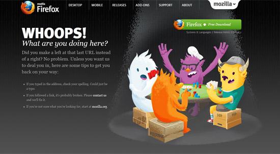
Mozilla is known for providing an exceptional user experience; in fact, the company’s UX team even held an AMA on Reddit once to talk about some of the best practices they follow. The company attributes its user satisfaction to its attention to detail, so it isn’t at all surprising that the team’s developers have created an exceptional 404 page. Why is it so effective? First of all, the page offers a number of tips to help the user out:
- Mozilla recognizes that many people may have tried entering the link into the address bar manually. They may have accidentally misspelled the url, so the first point on the page advises them to check the spelling.
- The page also points out that some people may have followed broken links. They recommend that people contact the site admin to improve the experience for future visitors and suggest visiting the homepage to try to find the original page that way.
- The page has a picture of some gremlin-like creatures playing poker. The implication is that the user accidentally crashed their game, which adds a touch of fun and helps to make the experience more engaging.
The second point on this list is probably the best part of this 404 page. Mozilla’s clear commitment to improving the user experience for future users positions the company well as one that takes care of its current and future users.
Henrik Hedegaard
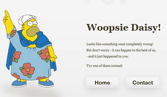
Henrik Hedegaard is a well-known IT architect who’s currently working for Designit. He also manages his own site on various architecture, ND imaging and IT topics. Since his professional reputation hinges on his ability to deliver a great user experience, Hedegaard has created a 404 page that helps engages with his visitors and points them in the right direction to find the information they’re seeking.
Interestingly, according to Alexa, nearly 100% of Hedegaard’s search traffic is coming from the key term “404 error page design” – visibility he’s gained for his site by offering a superior user experience.
Here are a couple of takeaways from the 404 page on Hedegaard’s site:
- Hedegaard using an image of Homer Simpson on his page indicates that he’s taken the time to understand his customer demographic – presumably, mostly younger men who are familiar with and relate to the Simpsons.
- Hedegaard also offers two different options to help his lost visitors – they can either click to the contact page or visit the home page. Since users may have different preferences, Hedegaard’s 404 page empowers them to decide which course is best.
Allison House
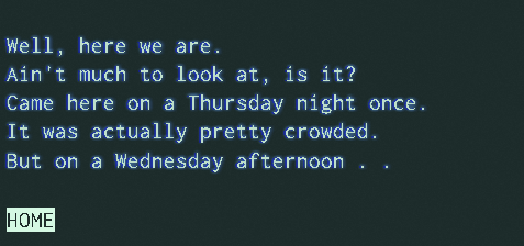
Allison House is another IT professional that’s invested time and energy into making an engaging 404 page for her site. Her 404 page is possibly the most unique version I’ve ever come across, as it types the following words in real time:
“Well, here we are.
Ain’t much to look at, is it?
Came here on a Tuesday night once.
It was actually pretty crowded.
But on a Wednesday afternoon…
I guess it’s just you and me.
Heh.
Home”
House’s page is the only 404 page I’ve found that displays a message in real-time like this. Can you even imagine how powerful this strategy can be in terms of keeping the user hanging on for more information? If you landed on this page, you’d almost certainly wait through the animation to see what the final message will say. Without this, many of House’s users would undoubtedly just click the back button as soon as they saw a 404.
House also offers a link to her home page to improve navigation. The link is clearly highlighted, so users will notice it and know to click there.
But the best part of her 404 page is that it’s designed to resemble a text-based operating system like Ubuntu. This definitely adds to the novelty factor and supports the nostalgic feelings she’s trying to convey throughout her site.
House has written a blog post about her 404 page where she stated that it clearly resonated with her viewers, as a number of them went on to share it on Twitter. Her Twitter followers made it very clear how much they like her approach, posting messages such as: “The best 404 site – by the best @house. Reminds me of Portal. Hope you’ll do 509, 504, 502 and 418.” Her page was even promoted by Sacha Greif, a popular designer that co-authored Discover Media.
House probably never expected that her 404 page would be engaging enough to generate this much exposure!
EyeEm
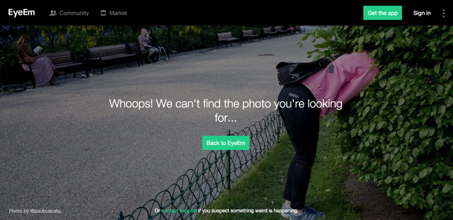
EyeEm is a community for photographers to gain exposure and sell their work. The site offers a simple but clever 404 page that reads “Whoops! We can’t find the photo you’re looking for…” atop a background image of a woman looking in a bush – presumably because she’s lost something important.
The page works well, in part because of its professional photo that’s on point with the page’s message. Since EyeEm is a community for photographers, the image supports the branding message that the site is trying to convey.
The site also provides links to the contact support and home pages giving customers the options needed to find the pages they’re looking for. The site wide menu and search bars are also available on the 404 page, offers additional options for people to remain on-site and interact with EyeEm’s other content.
Tripomatic
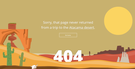
Tripomatic is a popular tourist information site, and the site’s 404 page is consistent with its theme. The page reads “Sorry, that page never returned from a trip to the Atacama desert,” but what’s really smart about Tripomatic’s approach is that the text “Atacama desert” is linked to a search tool that allows users to find a region for their future trips.
The user also has the option of clicking a link at the bottom to return to the home page, which may be a better options for some visitors – particularly those that haven’t created an account or aren’t signed in yet.
Wikipedia
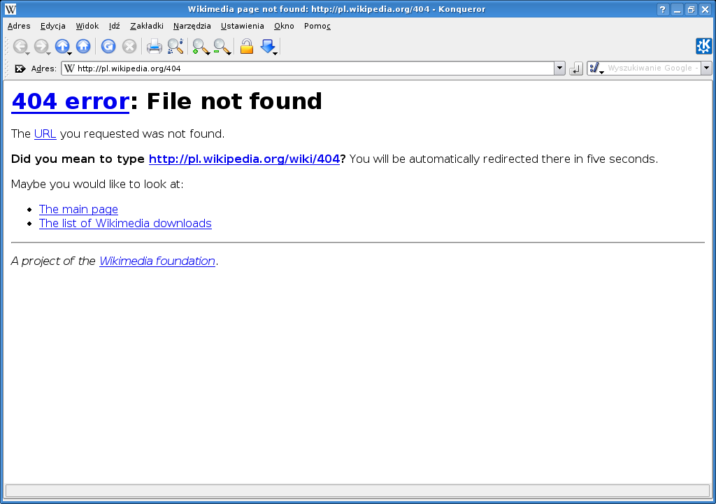
The 404 page on Wikipedia is a lot more conservative, but that’s probably a good thing, as the site has a more serious purpose. Here’s an example of a message you’ll receive if you try visiting a page that doesn’t exist on the site (in this case http://en.wikipedia.org/sldjfjslkafja).
“Error
404 – File not found
http://en.wikipedia.org/sldjfjslkafja
We could not find the above page on our servers.
Did you mean to type http://en.wikipedia.org/wiki/sldjfjslkafja? You will be automatically redirected there in five seconds.
Alternatively, you can visit the Main Page or read more information about this type of error.
A project of the Wikimedia Foundation”
The message is pretty straightforward and quickly redirects the visitor to a dummy page for the URL that they entered, giving them the option to create a page for the content they were trying to find. Not only does this option open visitors’ eyes to possible areas to contribute to on the site, it also benefits Wikipedia through the creation of additional, though often unintended content that will support future users.
Blue Daniel
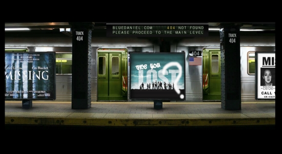
Blue Daniel is a film studio with movies on every page of its website, so it’s no surprise to see the same motif carried over to the company’s 404 page. Currently, the page has posters from a number of different movies rotating, including signs from pop culture movies and TV shows like “Lost” and “Missing.” This page is a creative and engaging way to tell people they visited a page that in a way that’s keeping with the tone and mission of the overall site..
If you dig around, you’ll see that there are a couple of things that Blue Daniel could do to improve the functionality of their 404 page. The page does have a link to the home page, but it doesn’t currently work upon click. The mobile nature of the element may also make it difficult for visitors to click in the first place, though that’s clearly intended by the site’s designers.
Starbucks
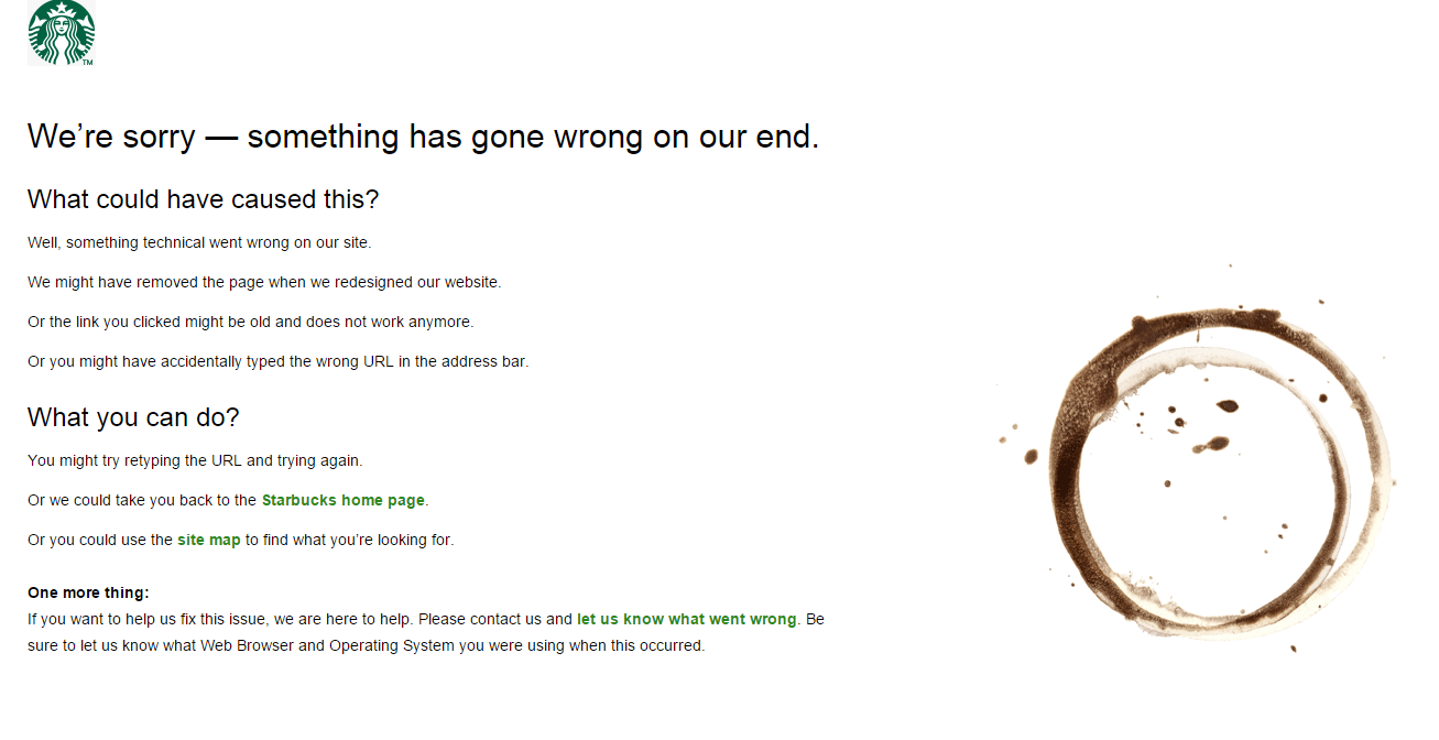
Starbucks may not use the same humor as some of the examples listed above, but its 404 page communicates exactly what the customer needs to know and do to find the content they were initially looking for.
The page is broken up into three sections with headers to help the users navigate the page. The first section provides a list of reasons that the user may have come across the 404 page, while the second section offers some tips to help resolve the issue. Finally, the third section suggests that the reader contact the customer support team for additional information.
This straight-to-the-point style that offers guidance in a clear, articulate way is ideal for the Starbucks brand. The ring of coffee is a nice touch as well, as it helps reinforce visitors’ desire to pick up a cup of coffe on their next visit.
What Do These Practices Illustrate?
The 404 pages in the above examples are all unique, but looking across all of them, you can see a few similarities. Here are a few of the lessons you can learn from the creators of these pages:
Create 404 Pages that Align with the Theme of Your Site
The developers that created the above 404 pages clearly took the time to understand their readers, which allowed them to develop designs that resonate with their interests and the brands they’ve built. If your site focuses on providing high quality visual content, you simply must include it on your 404 page as well.
Offer at Least One Link to Another Page
Improving navigation and helping the readers find their desired content is a crucial part of the user experience that’s often overlooked on the 404 page. You can easily remedy this by adding links to pages of interest, which will make it easier for your readers to find the material they’re actually looking for.
As you build out your 404 page, provide links to one or more of the following pages:
- The home page, since this is where most people know how to best interact with your site.
- The contact or support page, where users can easily connect with you for additional assistance or report broken links.
- One of your other key functional pages, which may help readers find the information they need. Tripomatic handled this very well by helping their lost visitors navigate to the destination search page – the page that most of their visitors are likely to be looking for.
You’ll also need to think about what users were doing before receiving a 404 error, as this will help you decide which links to include on the page.
Use Clever Visuals to Engage Your Readers
This is 2015 – every page on your site needs to have quality visuals on it. Graphics play a hugely important role in user experience, which is why they deserve a place on your 404 page too. That said, not all images are created equal. As you build your error page, you’ll need to choose images that are appropriate for your target users.
Make sure that any visuals that you use are high quality. While 404 pages don’t usually receive nearly as much visibility as other content on your website and don’t have the same conversion goals, they still need to make a good impression. Use images or video that reflect positively on your brand, rather than low quality clip art.
Ultimately, it’s clear that 404 pages play an important role in your site’s user experience – even though they’re probably the last pages you think about when looking at a site map. The most popular brands understand the need to make them engaging and easy to navigate. Follow their lead as you build your 404 page to avoid losing visitors that click a bad link or type an address incorrectly.
Do you have a unique 404 page on your site? Share your example or any other tips you have on creating these important pages by leaving a comment below: