Mobile to overtake fixed Internet access by 2014!
That was the headline – and prediction – that Mary Meeker, venture capitalist and former Wall Street securities analyst, made in 2008.
A few years later, Eric Schmidt of Google announced the search engine giant’s new “mobile first” approach, and shared Mary’s prediction that smartphones would quickly overtake PCs in terms of sales since smartphone sales were already growing at 30% YoY back in 2010.
And ever since then, we have been hearing a lot about how important it is for e-commerce brands to focus on mobile traffic.
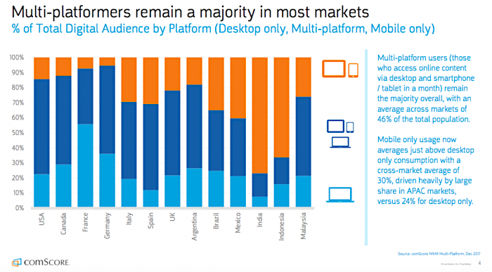
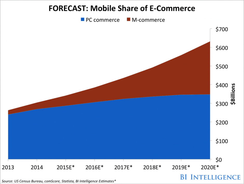
Today, we’re long past this tipping point in some countries, with India, Mexico and Indonesia having 4x more smartphone users than desktop users. Desktops are still popular devices for placing online shopping orders, but mobile devices, especially smartphones, are catching up, as shown in the image below:
Stats show that for most industries, a major part of online traffic comes from mobile devices:
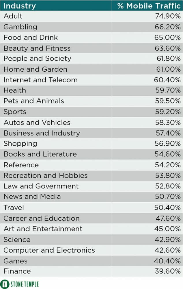
This makes it extremely important to ensure that your website and mobile app are primed for mobile viewing.
It is also observed that the time spent on mobiles is much higher than that on desktops:
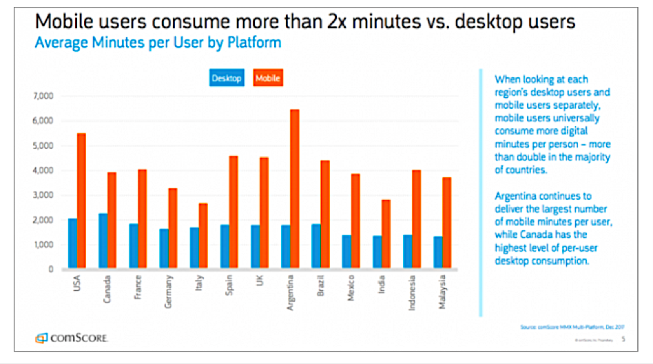
This means that if you’re not optimized for mobile traffic, you’re basically ignoring most of your potential customers. And that’s never good for your conversion goals.
Increasing Conversion on Mobile
Thanks to increasing competition, the challenge for any e-commerce business is to make visitors convert. The revenue projection illustrated in the image below provides information on worldwide retail e-commerce sales from 2014 to 2021, and points to an opportunity for all e-commerce players.
The sheer number of websites and apps providing similar products at competitive rates requires you to be on your toes and devise radical marketing strategies to maintain your market share.
And even after convincing an online buyer to come to your website through various sources, there are still multiple steps before the buyer completes a purchase. Understanding and optimizing the customer journey and pain points, therefore, becomes increasingly important. And this is the reason for the huge difference between your web traffic and sales.
Here’s how to avoid missing out on any of your potential mobile customers.
Learn More:
- Mobile-First Indexing: Everything You Need to Prepare Your Site For 2018
- How to Build a Social Media Marketing Conversion Funnel
- Making Data-Driven Decisions for Better Website UX
Check out this 3-minute video on “How to Build a Homepage with a Huge Conversion Rate“:
12 Quick Fixes to Make Your Mobile Traffic Convert
- Move beyond the app vs. web war
- Focus on mobile responsiveness
- Reduce load time
- Have a clear value proposition
- Facilitate easy navigation
- Try different colors, copies, and sizes for your CTAs
- Add trust badges on checkout pages
- Maintain internal consistency with UI
- Make signing in and checking out simple
- Experiment with pop-ups
- Add reviews and testimonials
- Offer free shipping
1) Move Beyond the App vs. Web War
The first step that you need to take in order to convert your mobile traffic is to move beyond the dilemma of mobile app versus mobile web.
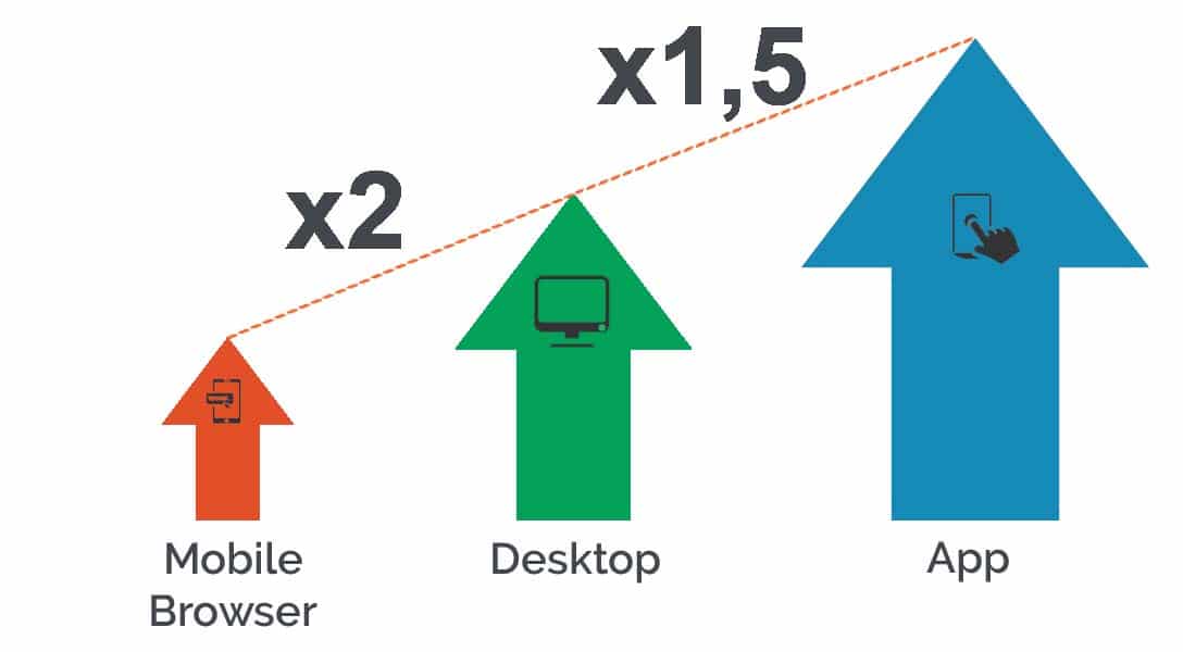
According to research, mobile apps are more effective when it comes to making a purchase: customers browse almost 4.2x more products per session when using apps, as opposed to mobile websites, and have a 3x higher conversion rate. This confirms that apps are definitely pushing more people down the conversion funnel.
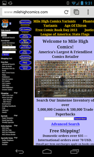
If you are catering to your mobile audience only through mobile web, that’s okay – just make sure your mobile website looks nothing like this:
There’s not a lot of difference in the accessibility of mobile apps and mobile websites as both of them are accessed via a mobile device such as a phone or tablet. While some marketers are comfortable with using only mobile websites, others understand the necessity of having a mobile app for their business so they don’t miss out on any mobile traffic.
If companies aren’t aware of where their potential customers are spending most of their time, they’ll lose out. Take a look at some stats from an eMarketer report to see the difference between time spent in-app versus mobile web:

2) Focus on Mobile Responsiveness
They say that CRO and UX are a match made in heaven, and they are not wrong at all. Users would not want to spend their time on a website or app that doesn’t function properly or is not compatible with mobile devices. For such websites or apps, the result is a high bounce rate and a low conversion rate.

For your mobile website, start with running a hygiene check with Google Console to ensure that you have mobile responsiveness. To learn more about mobile responsive testing, read this additional resource.
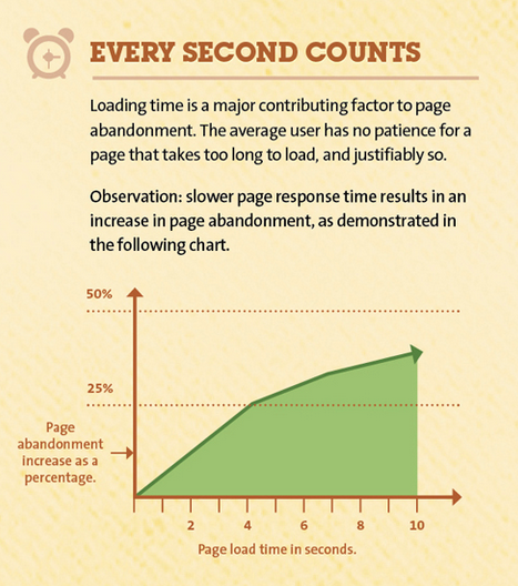
3) Reduce Page Load Time
No matter how you measure it, fast page speed improves both ranking and conversions. The exact number of ideal seconds varies, but most experts suggest that your website should load in 4 seconds or less. So fixing your page load time is a super simple way to help your mobile traffic convert.
Learn More:
- 3 Keys to Updating Your Website for Optimal User Experience
- 15 Fast and Easy Ways to Improve Your Site’s Conversion Rate
- How to Easily Set Up a High-Conversion Facebook Retargeting Campaign
- How to Increase Your Conversions with Online Customer Engagement
4) Have a Clear Value Proposition
This happens to be the most crucial factor for any e-commerce company. If you are not communicating your value proposition (something of value that you offer your prospects) clearly, then you are missing out on a great opportunity to convert your website visitors into customers. If your prospects can’t understand what you’re selling and how your offer could benefit them, why would they buy from you?
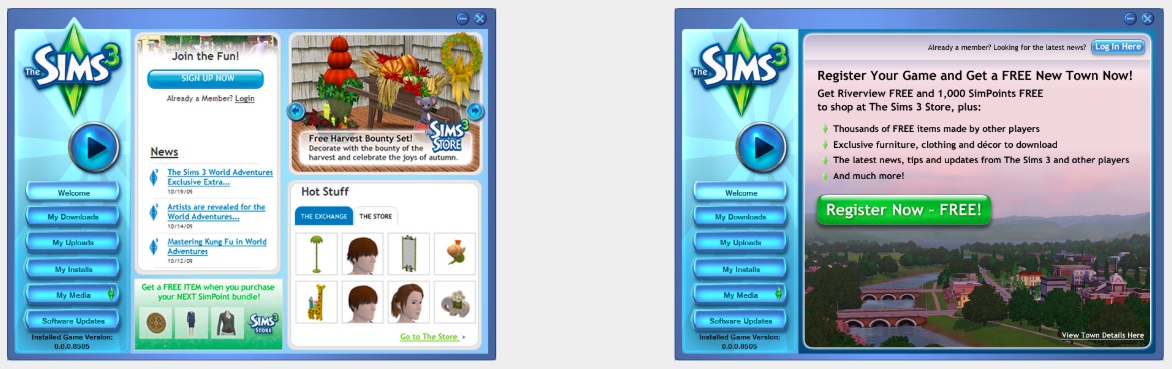
The Sims, one of the best-selling computer game franchises in history, wanted to increase the number of registrations for its Sims 3 online store, so to achieve that they ran a test. As you can see from the two images below, the test CTA (on the right image) clearly states what the visitor should do (‘register now’) and emphasizes the term ‘free’, and the result was an astonishing 128% more registrations:
5) Facilitate Easy Navigation
You think you know best what your visitors want? Nope — they know best!
You just need to help them find what they came looking for on your website or app. To do this, ensure that your website navigation and app accessibility are clear and simple. Making sure that your visitors can find what they need and explore other options is what your design strategy should be.
Here are some additional tips to ensure easy navigation for your website visitors or app users:
- Create a menu that is distinctive and contains easy-to-understand navigation terms.
- Add popular links to your sidebar or in-line anchor CTAs that direct traffic to your important pages.
- Direct your leads to CTAs through directional arrows and text, and having a search section on the top of your webpages is always recommended.
If you’re unsure whether to choose a hamburger menu, tab menu or gesture-based navigation for your navigation, check out these pros and cons.

6) Try Different Colors, Copy & Sizes for Your CTAs
Your Call to Action (CTA) makes a significant difference to this conversion process. The color, size and copy, along with positioning on the page, constitute a huge factor in conversion.
Performable found that changing the CTA color from green to red boosted its conversion rate by 21%:
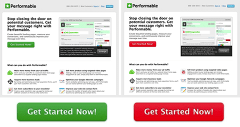
But keep in mind that just because a red button outperformed a green button for one company doesn’t mean that you will have the exact same results. You definitely need to test different colors, wording and placement for your own CTAs, depending on the emotion you want to trigger, the conversion goal and your brand’s overall style.
Learn More:
- How To Create CTAs that Actually Cause Action
- 4 Simple But Useful Conversion Rate Optimization Hacks
- How to Increase Mobile Conversions With Facebook Lead Ads
- Top 10 Mobile Optimization Best Practices For E-commerce Sites
7) Add Trust Badges to Your Checkout Pages
A trust badge, sometimes called a secure site seal, is something you’re likely already familiar with if you’ve ever noticed these small icons displayed on a website, particularly on store or payment pages:

When asking a customer to spend money on your site, it is imperative that they feel absolutely secure when inputting their personal credit card numbers. Security has a direct impact on abandoned cart rate and sales.
A survey conducted by Matthew Niederberger on Actual Insights found that “61% of participants said they have at one time NOT completed a purchase because there were no trust logos present.”
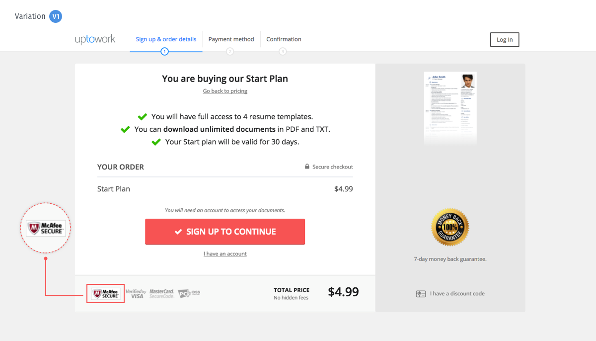
Additionally, here’s a case study of Uptowork, a career site and online resume-building platform, where they experienced a significant uptick of 1.27% in sales when they added a McAfee trust badge.
Building trust is a long-term process, and it doesn’t happen overnight, although one method of making your buyers feel secure is by adding trust badges from Symantec (formerly VeriSign), Trust Lock, Go Daddy, McAfee, etc. Remember, though, you must back up your promise of security with actual security!
8) Maintain Internal Consistency with UI
Besides having a consistent message, product offerings, and other basics, your User Interface should also be consistent throughout. Not having this in place can can make your application or website design look chaotic and confusing to the viewer, but maintaining visual consistency can help users easily navigate and communicate with your system.
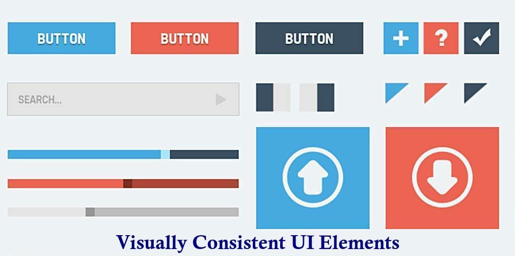
Without a doubt, the look and feel of a website’s design is important. However, how well the UI functions also plays a crucial role in the success of a web page.
Website building service BaseKit saw a 25% increase in conversions by redesigning their “plans and pricing” page. They discovered that they did not, contrary to popular opinion, have to put the important information above the fold to be successful.
Veeam saw similar improvements by changing their “Request a quote” CTA button with “Request pricing”.
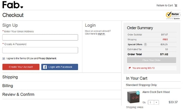
9) Make Signing In and Checking Out Simple
Not all your visitors want to create yet another online account before buying something on your site, particularly on that first purchase. Long-form checkouts tend to frustrate most visitors to the point where they cancel their transaction. In fact, 86% of people are annoyed when they are forced to create a new account on websites.
Give them the option to sign in with their social profiles. Social sign-ins, like your Google or Facebook logins, speed up this process.
For most sites, a social login option is killer because the frictionless, one-click sign-up of an existing account is attractive to users and has a pretty good conversion rate. Since most people are already logged into their social accounts (or at least have their social password memorized).
Intel Security surveyed 2,000 adults in the U.S. and found that the average person has 27 online logins and 37% forget at least one password on a weekly basis, which leads to password fatigue.
For checkout pages, get rid of those long or multi-page checkouts and opt for single-step, single-page, or single-click checkouts instead. If your e-commerce store is on Magento, you have this option handy.
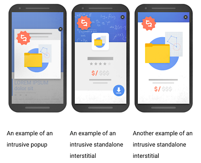
10) Experiment with Pop-Ups
If you think pop-ups will help you convert, you may want to consider Google’s intrusive pop-up penalty, since most users consider mobile pop-ups annoying:
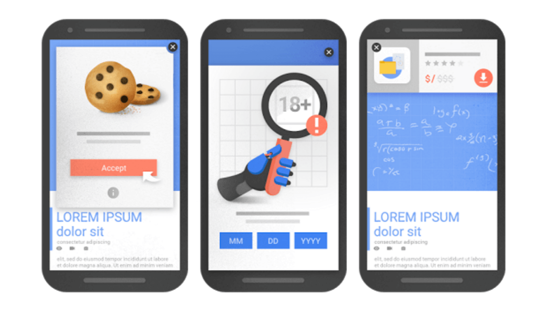
But there are some pop-ups that are not considered intrusive as they “do not require a change of size, design or position within a page,” such as:
- Age-verification blockers that act as a shield for certain content, such as alcohol-related or adult content
- Cookies that use pop-ups that serve as consent notifications
- Any other type of legally required pop-up
11) Add Reviews and Testimonials
One way to get the edge on your competition is by proving to be a more credible brand. Let’s say that both you and your competitor offer the same product at the same price, but you want the visitors to buy from you. For this, you need to convince them that your brand is better. One way to do this is by adding testimonials and reviews for your products and brand.
88% of customers consult reviews before making a purchase.
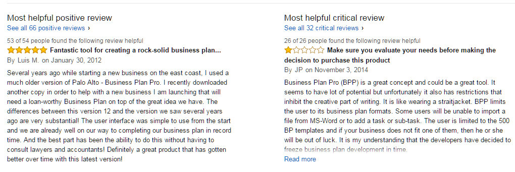
See how Amazon aggressively promotes its user reviews on product pages:
Learn More:
- How Mobile Apps Are Reshaping the E-commerce Industry
- Top 10 User & Customer Feedback Tools to Improve Conversion
- The Complete Guide to Brand Building (Must-Read for Digital Marketers)
- How to Create Intent-Based Content to Improve Conversions
12) Offer Free Shipping
It’s universally observed that consumers tend to buy more than they had come for when offered the free shipping incentive. After all, who doesn’t like free things? Free shipping is pretty much guaranteed to drive up traffic and sales, as well as turn around some of your cart abandonment woes.
The Walker Sands 2016 Future of Retail Study found that 90% of consumers say free shipping is their number one incentive to buy more.
Free shipping is so attractive that 60% of e-commerce merchants rank it as their most effective marketing tool, especially when combined with conditions such as reaching a minimum order amount. In a study of 100 million transactions, free shipping was 2x more popular than a discounted price.
Final Words
As we all know, one size does not fit all. Some of these tips may or may not work for your e-commerce store or your niche, so you need to test everything and see what works for your business.
In most cases, testing alone without a structured approach does not suffice, so if you’re unfamiliar with structured approach to conversion optimization, you can learn about that here.
Taking the time to understand what consumers are telling us through their on-site behaviors is always a wise action to take. Listen to what they are trying to say and make necessary amendments. And remember, if you’re not optimized for mobile traffic, you’re basically ignoring most of your potential customers. And that’s never good for your conversion goals!