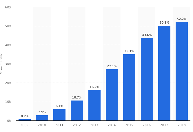
The share of mobile phone traffic has grown from 0.7% in 2009 to 52.2% in 2018 and this is expected to grow even further.
But despite overall mobile use and mobile engagement in e-commerce on the rise, desktop users are still leading the way when it comes to converting. Although the “add to cart rate” for smartphone users is 4.7%, the “sales conversion rate” is only 0.8% — compared to desktop users which is 8.52% and 2.78%, respectively.

Keep in mind, however, that responsive design is not the same thing as mobile optimization. As Talia Wolf of ConversionXL says, “Traditional (i.e. web) optimization and mobile optimization are two separate practices, requiring two separate strategies. One is not replacing the other. Instead, optimizers must learn to master both.”
So what does this mean for a large e-commerce site? It means that the focus should be on improving the overall mobile user experience in order to convert more leads from mobile devices.
In this post, I’ll show you 10 ways that large e-commerce websites can optimize their overall mobile user experience for maximum conversions and improved ROI.
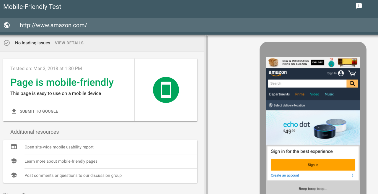
1) Take the Mobile-Friendly Test and Review the Mobile USAbility Report
The very first step in proper mobile optimization is checking your website with Google’s Mobile Test tool. This will help you discover and fix the preliminary issues that Googlebot might face while crawling your site. If your page is completely mobile friendly then the tool will display a message like the one below.
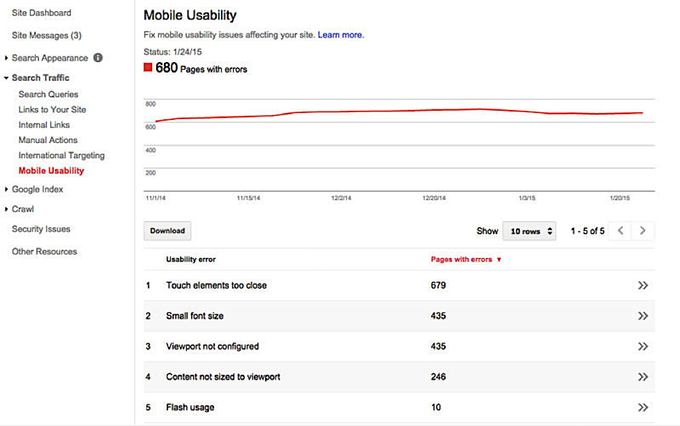
View the Mobile USAbility Report and check for issues related to Flash usage, viewport not configured, content not sized to viewport, small font size, and having touch elements too close. Moreover, regularly monitor the Search Console for 404s, site crawling issues, server connectivity issues, DNS issues, URL error issues, etc.
An example of Mobile USAbility report is given below:
Learn More: Mobile-First Indexing: Everything You Need to Prepare Your Site For 2018
2) Make the Checkout Process Flawless and Intuitive
Between a small mobile screen and having to navigate with one’s fingers, it’s crucial to make the checkout process as simple and intuitive as possible. As you saw in the graphic in the intro, most people who add items to the shopping cart do not wind up actually completing the purchase.
Place the CTA on the top of screen in the conversion path for maximum visibility. Pull visitors to the checkout page even when they are reading content – not just when they’re in shopping mode – thanks to the magic of the embeddable-anywhere Buy Buttons provided by BigCommerce. These Buy Buttons allow shoppers to purchase directly from your blog, email, social media posts, etc.
When it comes to generating more sales, what more do you need when you can power your shopping experiences outside of your online portal?
You can easily generate embeddable code and use it wherever your like. Moreover, you can customize it to match the look and feel of your brand. A Buy Button also helps to reduce cart abandonment because shoppers can go directly to the checkout page and complete the sale.
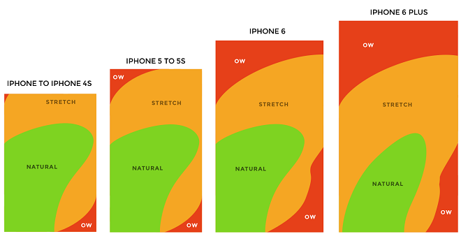
Also, when designing your mobile interface, do not deviate the users from the main (and easiest to navigate) path, but rather, keep them in the “Thumb Zone.” This heat map shows the most common use case of the average user, which is:
- one-handed use
- right thumb on the screen
- thumb anchored in the lower right-hand corner
Once your prospect visits the checkout page, follow these best practices to convert them easily:
- Test the mobile version of your checkout process so that it remains intuitive.
- Remove all distractions from the checkout process as this will ensure that customers complete the entire purchase process.
- Use digital wallets like Apple Pay, PayPal One-Touch, Visa Checkout and Amazon Pay. Use of digital wallets is an essential part of mobile checkout optimization and allows you to accept payments thereby minimizing cart abandonment.
- Use security seals and trust symbols to win the confidence of your customers.
- Use clear CTA text that shows users exactly what they are going to get.
- And finally, seek the help of your offline sales team because your sales team will understand the importance of a single chance to make a first impression in sales. Don’t blow your initial chance to convert the customer; all the elements that you use on your website play a huge role in this regard.
Learn More: How Mobile Apps Are Reshaping the E-commerce Industry
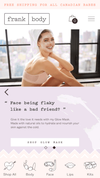
3) Use a Top Navigation Menu
For e-commerce sites, it is necessary to use a top navigation menu as this allows customers to easily navigate your site from wherever they are browsing and take action.
Have a look at the below coffee scrub site, Frank Body, and how it uses a top navigation menu to generate more sales.
4) Add Click-to-Text on Your Website and Ask Users to Join Your Mobile Group
Many people are hesitant to become a customer on their first visit to an e-commerce site, but asking them to become a member of your mobile group in order to get rewards and discounts can be a nice way to convert visitors into potential customers.
Tools like Text Request allow customers to directly message you through your website with the help of Click-to-Text, and they claim that you can reach 4X more people. The base code for adding a text button on your site is:
<a href=”sms:14232180111“>Send us a text!</a>
Replace the 10-digit text number with your own text number leaving the 1 in front of your 10-digit number.
This is an easier option for many customers as most people do not like to call directly. Messaging is easier when you can reach the customer on their mobile device and and thus open the door for better conversions.
5) Display Trending Products in a Collage Format
For e-commerce sites, it’s more important than ever to showcase your products with beautiful images in a catchy layout that makes it easy for potential customers to find – and purchase – what they want.
Etsy, the e-commerce site that is focused on handmade or vintage items, does this well, especially on mobile. They display large images of trending products to ensure that they are easy to tap with a finger.
Related Content: SEO for E-commerce Sites (Beginner & Intermediate)
6) Offer Options for Both Searching and Browsing
It is important to understand what your customers want when they visit your site. People come to your site either to directly search for specific products or to browse through the available options.
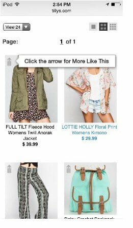
Have a look at the below example from Tillys where it displays a prominent search box on the home page.
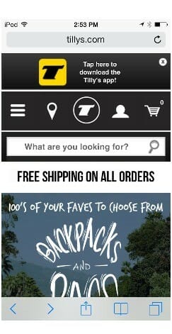
For easier browsing of products, an arrow button is displayed that allows users to look through similar items so they don’t need to go back to the menu.
Related Content: Marketer’s Guide to Mobile App Advertising
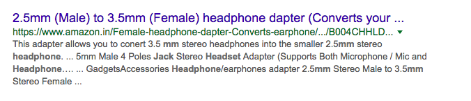
7) Add Mobile Rich Snippets to Your Site
How will you persuade the user to click to your site in the search results? Displaying rich snippets is a great way to do that.
The product snippet is the most important snippet that you should definitely add to your site. Product snippets help to display product features and aggregate ratings. Also, the color of the product or the size of the item can be displayed using this snippet:
One of the easiest ways to add rich snippets to your site is to use the Structured Data Markup Helper.
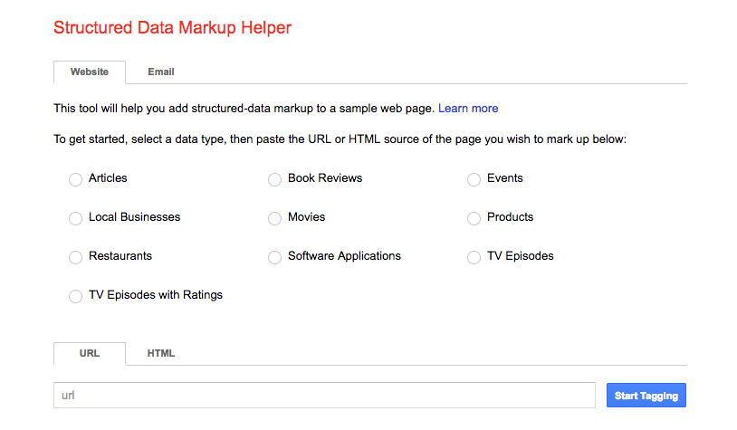
Simply choose “Products” from the bullet list and start tagging your products. Once you have the code with you, test it using the Structured Data Testing Tool. If the code works, then add it to your website and start improving your CTR in the search results.
8) Create Video Product Demos
When shopping online, particularly for clothing, it can be difficult to gauge exactly how an item will fit you without trying it on. Creating product videos or GIFs is one of the best ways to help people better understand the product’s fit or usage.
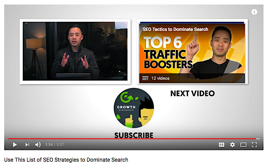
With product demo videos, remember that context is important, so adopt a storytelling approach and always include a CTA at the end of the video. This SEO strategies video from Growth Everywhere does this nicely with a “Next Video” and “Subscribe” CTA:
You can also opt for GIFs like the one provided below. Labellemafia Clothing presents moving images for the user so that they can see how the clothing will look when they actually wear it.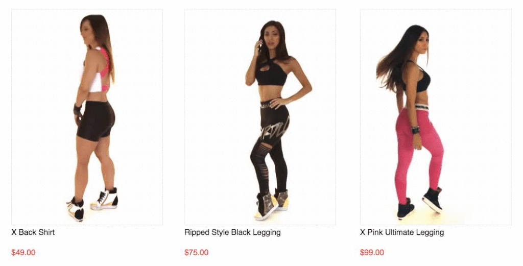
Related Content: How to Produce Paid Facebook Video Ads for Mobile Like a Pro
9) Speed Up Your Site and Create AMP Pages
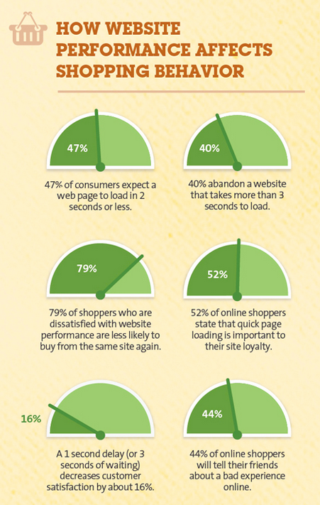
For large e-commerce sites, speed plays a crucial role in conversions because the server is already loaded. Slow loading times literally kills the user experience. A fast website directly affects its performance which in turn affects the shopping behavior. This is what is explained in the below infographic:
Test the speed of your site using Page Speed Insights. Simply enter the URL of your site and it will display any issues your site has as well as suggestions to improve the loading time.
A couple years ago, Google released a new solution for this called Accelerated Mobile Pages (AMP), which makes your website load much faster and this in turn helps potential customers make purchase decisions easily. The first step is to AMPlify your home page or product page because this is where the user purchase journey starts.
Here are some components that you can use to AMPlify your site:
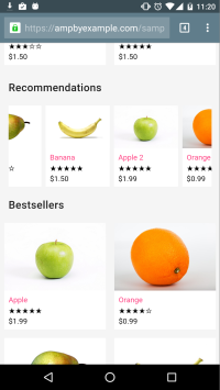
AMP Carousel
The AMP Carousel component lets you display a set of products in a carousel format where users can browse the products in an easier and effective manner.
Here is a sample home page or category page created by <amp-carousel>:
Here is a sample script for adding AMP Carousel:
<amp-carousel height=”300″
layout=”fixed-height”
type=”carousel”>
<amp-img src=”/img/image1.jpg”
width=”400″
height=”300″
alt=”a sample image”></amp-img>
<amp-img src=”/img/image2.jpg”
width=”400″
height=”300″
alt=”another sample image”></amp-img>
<amp-img src=”/img/image3.jpg”
width=”400″
height=”300″
alt=”and another sample image”></amp-img>
</amp-carousel>
AMP Video
The AMP video component lets you add videos to your pages, and the addition of interactive elements like videos aids in user action.
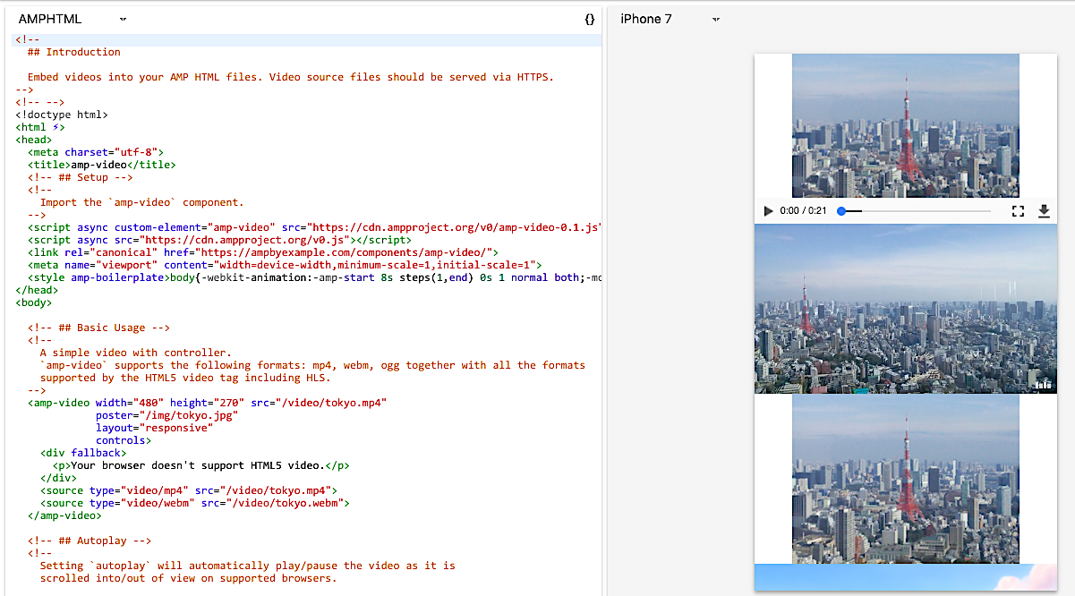
Here is a sample script for adding a video in your AMP pages:
<amp-video width=”480″
height=”270″
src=”/video/tokyo.mp4″
poster=”/img/tokyo.jpg”
layout=”responsive”
controls>
<div fallback>
<p>Your browser doesn’t support HTML5 video.</p>
</div>
<source type=”video/mp4″
src=”/video/tokyo.mp4″>
<source type=”video/webm”
src=”/video/tokyo.webm”>
</amp-video>
AMP Accordion
An AMP accordion component allows viewers to have a quick view at the outline of the content and easily jump to a section.
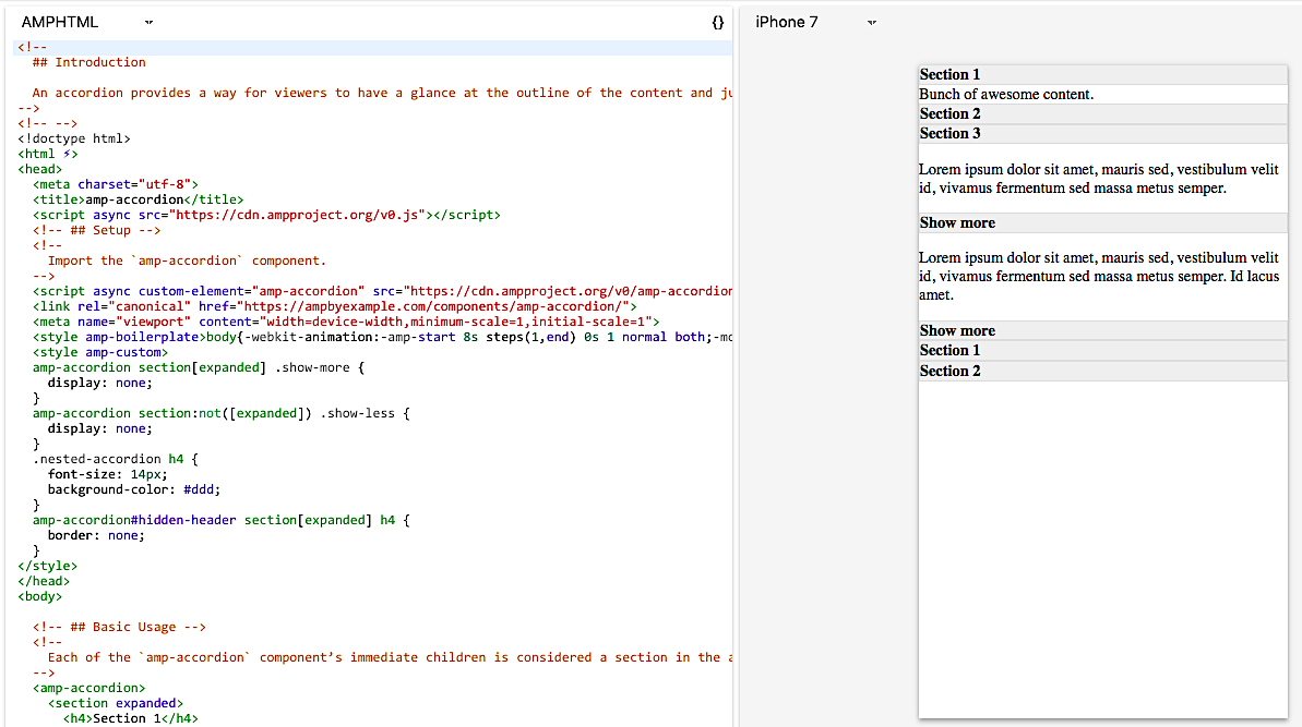
Here is a sample script for adding AMP accordion in your AMP pages:
<amp-accordion>
<section expanded>
<h4>Section 1</h4>
<p>Bunch of awesome content.</p>
</section>
<section>
<h4>Section 2</h4>
<div>Bunch of even more awesome content. This time in a
<code><div></code>.</div>
</section>
<section>
<h4>Section 3</h4>
<figure>
<amp-img src=”/img/amp.jpg”
width=”1080″
height=”610″
layout=”responsive”
alt=”an image”></amp-img>
<figcaption>Images work as well.</figcaption>
</figure>
</section>
</amp-accordion>
AMP Social Share
AMP social share component allows users to easily share your content across their social channels.
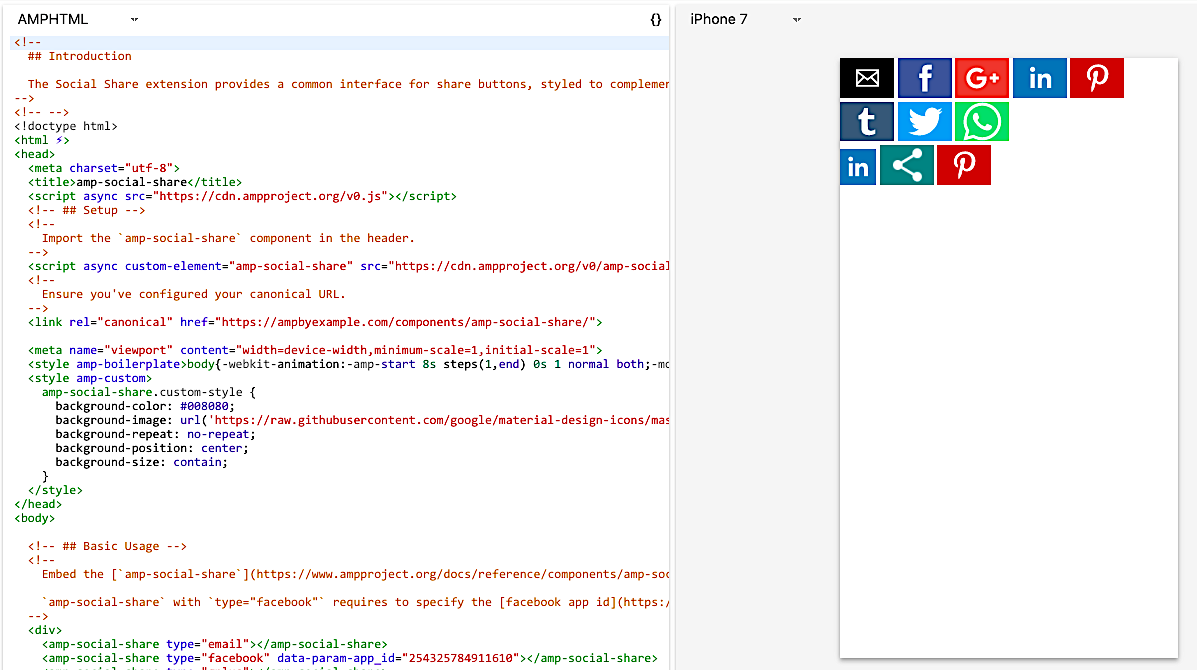
Here is a sample script for adding a social share button in your AMP pages:
<amp-social-share type=”linkedin” width=”60″ height=”44″
data-param-text=”Hello world”
data-param-url=”https://example.com/”>
</amp-social-share>
For a more detailed understanding of how to create effective AMP friendly e-commerce pages, I recommend that you visit this tutorial.
Once you have your AMP pages ready, the next step is to test them using the AMP test tool by Google. This will help fix any issues you are having in your newly created AMP pages before they go live.
10) Leverage the Power of Mobile Analytics
Mobile analytics refers to the practice of collecting user data and deriving actionable insights out of it in order to increase user sales and drive retention.
Here are some suggestions that every e-commerce store must follow to correctly track data and extract the most useful information out of it:
- The first step is to set up analytics tracking in Google Analytics. Or if your site runs on WordPress, then here is a guide to easily add Google Analytics to WordPress.
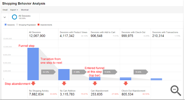
- Use shopping behavior analysis in GA to identify metrics like “no shopping activity” sessions, “cart abandonment” sessions, “checkout abandonment” sessions, etc. Have a look at the below screenshot of proper shopping behavior analysis that lets you see the number of sessions included in each stage of your purchase funnel, how many sessions continued from one step to the next, and how many abandoned the funnel at each stage. For complete tutorial, visit this resource.
- Use Cohort analysis to determine the time taken by the customer to make the first purchase and try to reduce it by taking appropriate actions like suggesting offers and discounts to them at the right time.
- Create user events that align with the customer micro moments and your marketing goals.
- The most important metric that every e-commerce store must track is the retention rate. A proper retention analysis helps you understand how many users are loyal to your brand and improve the overall customer retention rate.
Related Content: 14 Ways to Kickstart Your Mobile Email Marketing Campaign
Conclusion
Follow the above mentioned tips to improve the ROI of your e-commerce marketing strategy. As a marketer, you need to understand the I-want-to-buy moments that are specific to mobile shopping and have reshaped the purchase journey of customers and prospects. Once you know that path, you can customize your strategy accordingly.